 55745af80f
Settings had three compounding problems: you couldn't find a setting, and once you found it, it didn't look like its neighbour. ## Organization — the nav was grouped by the wrong thing It was grouped by **scope** (Global / Runtimes / Project). Scope is an *attribute* of a setting, not a category — nobody opens Settings thinking "I need a project-authority setting." That single choice split five concepts across two groups, including **two nav entries both labelled "MCP Servers"**, distinguishable only by a small icon. Now grouped by topic, with paired sections adjacent and stating their own scope: 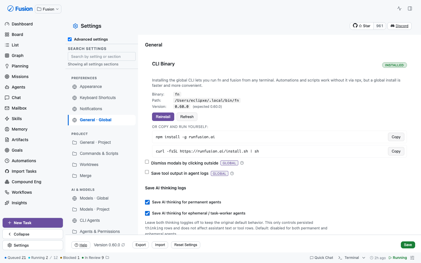 ``` PREFERENCES Appearance · Keyboard Shortcuts · Notifications · General · Global PROJECT General · Project · Commands & Scripts · Worktrees · Merge AI & MODELS Models · Global · Models · Project · CLI Agents · Agents & Permissions · Prompts · Memory AUTOMATION Scheduling & Capacity · Scheduled Evals INTEGRATIONS Authentication · MCP Servers · Global · MCP Servers · Project · Plugins · Runtimes · Secrets INFRASTRUCTURE Node Sync · Node Routing · Remote Access · Backups ADVANCED Experimental Features ``` ## Search — it now finds settings, not just sections Search matched only hand-written `searchableText` keyword arrays per nav entry, and those demonstrably rotted: Project Models accumulated 20 keywords across **two separate fixes** (FN-7907, then title-summarization on 2026-07-14) because operators searched "summarize" and got nothing. Every setting is now indexed from **its real label and help text** — 123 settings across 18 sections, zero curated keywords. The same query that was patched twice by hand: 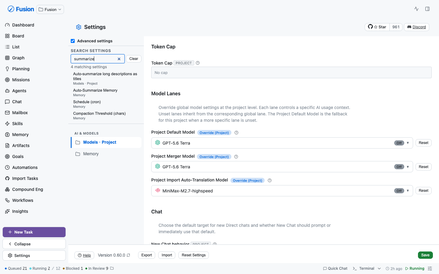 Two of those four hits match on *help text*, which a keyword index structurally cannot do. Picking a result jumps to the exact control, **opens its collapsed disclosure**, and highlights it: 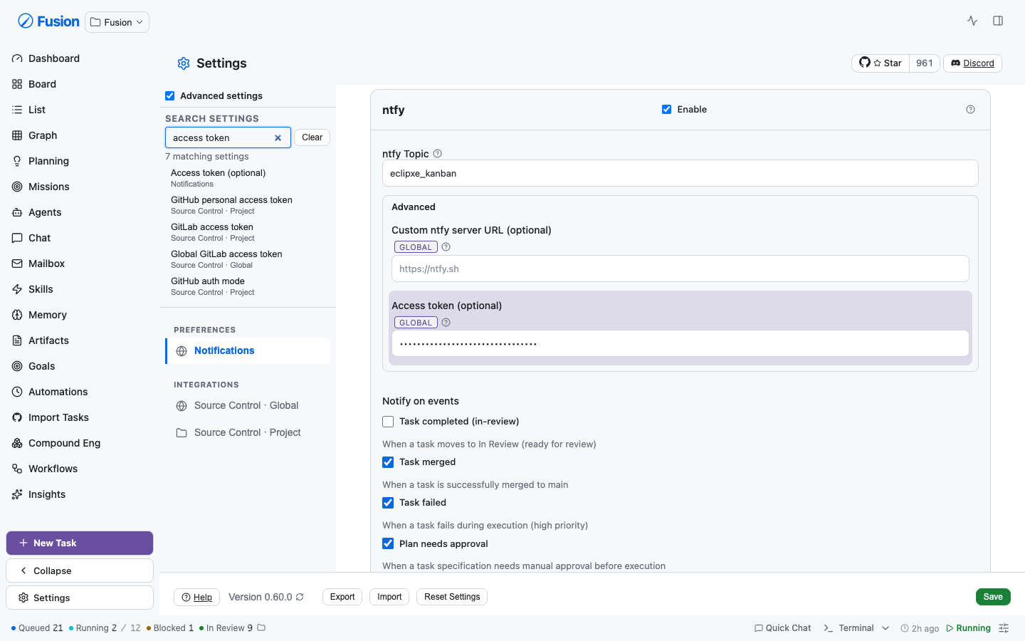 **This can't rot again.** `settings-search-index.test.ts` extracts every `descriptor={{ key }}` from section sources and fails the build if one isn't indexed. "All settings are searchable" is an enforced invariant, not a promise. ## Consistency — one type scale A text field's label and a toggle's label in the same section were styled **three different ways**: `.form-group label` (12px/600/uppercase/muted), a `.settings-content` override narrowing it to 0.72rem, and `.checkbox-label` (13px/500/sentence-case) whose every declaration carried `!important` purely to out-specify the other two. | | Before | After | |---|---|---| | Sections on shared primitives | 1 | **18** | | Indexed searchable settings | 0 | **123** | | `form-group` in settings | 226 | **98** | | `checkbox-label` in settings | 79 | **40** | 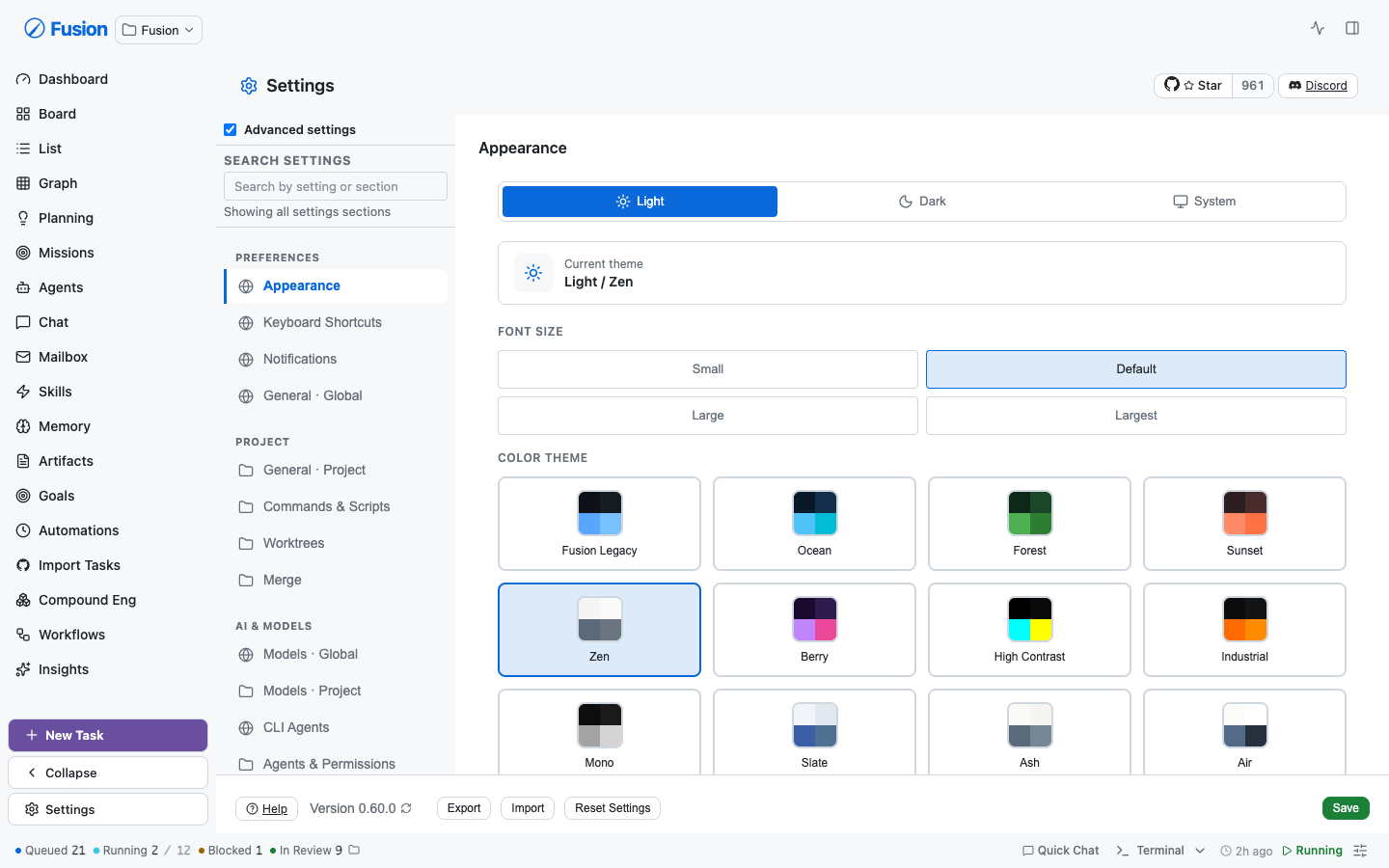 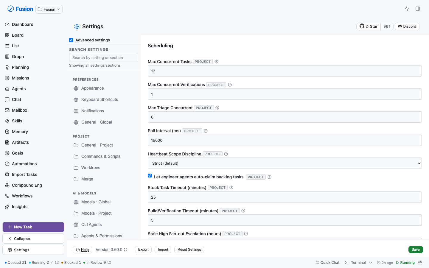 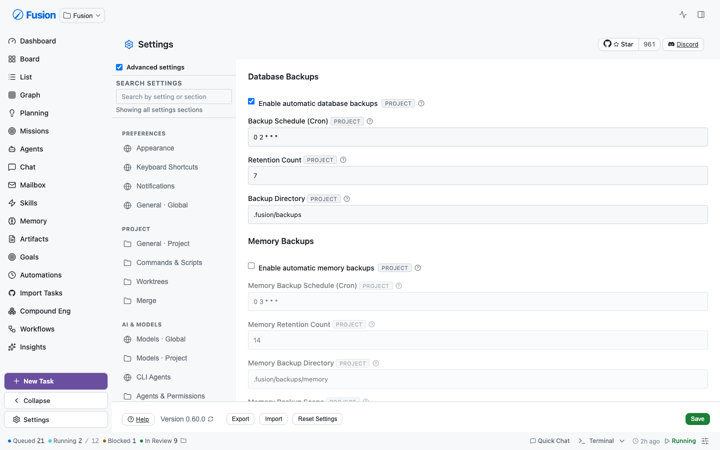 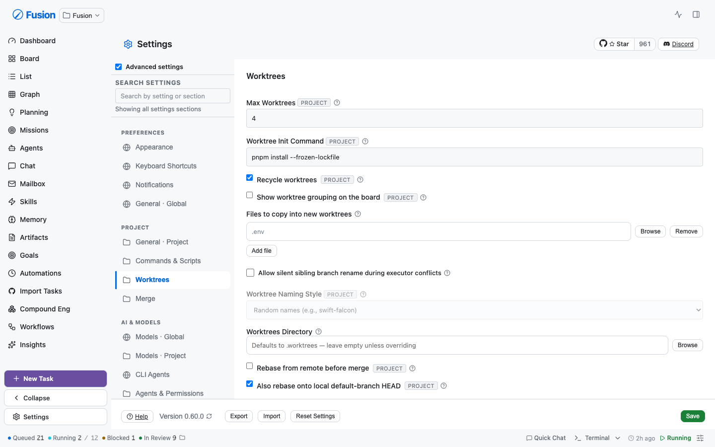 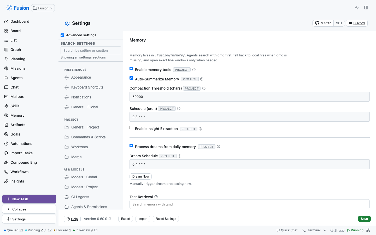 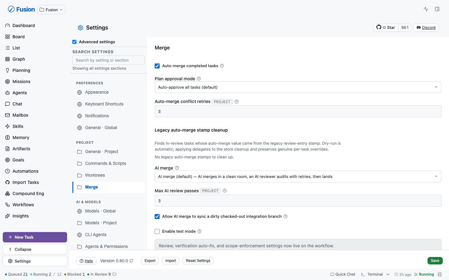 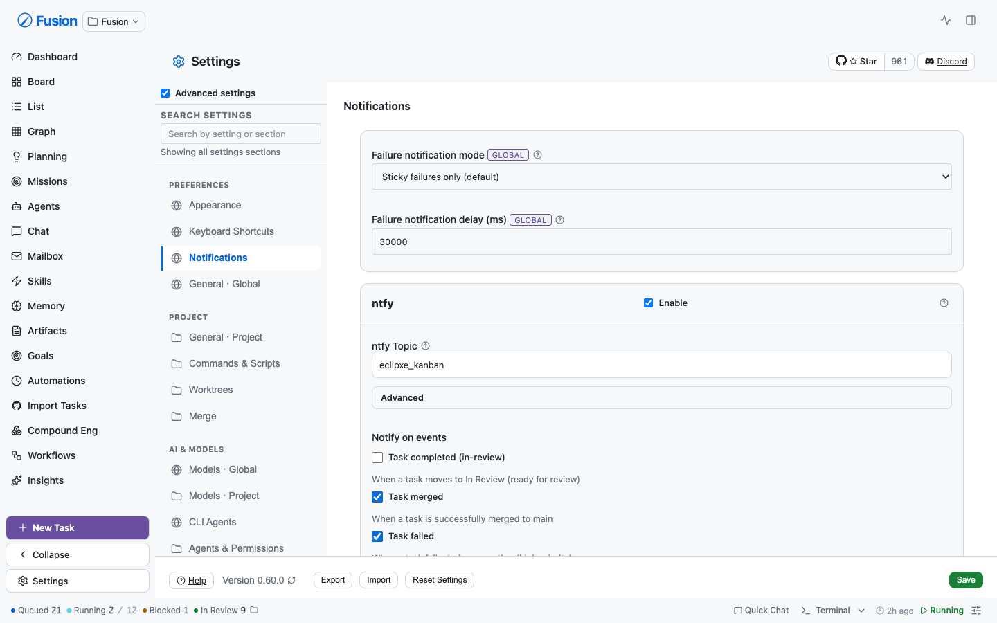 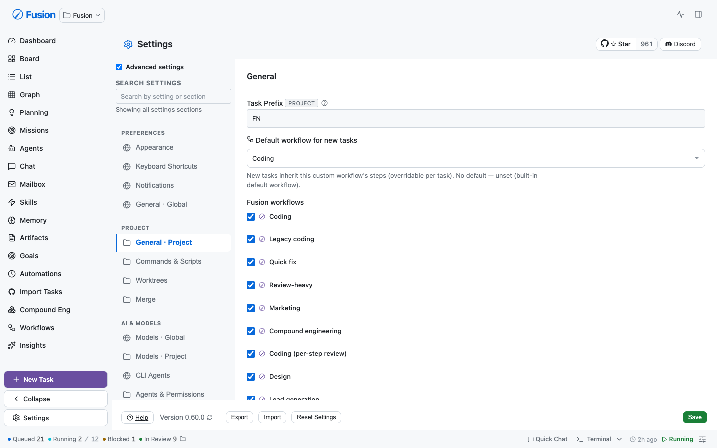 **Global `.form-group` is untouched** — 35 non-settings files style forms with it, so settings migrate *off* it rather than restyle it underneath the rest of the dashboard. ### A real latent bug this surfaced `--font-size-sm` and `--font-size-md` were named by **12 declarations** across AgentDetailView, DockTaskList, SetupWizardModal, and ModelOnboardingModal — but **defined nowhere**. Those rules silently no-op'd and inherited. The command-center token guard is the only thing that catches this class of omission and it doesn't cover those files. The scale is now complete (`2xs · xs · sm · base · md · lg`); `md` is 1.125rem to hold current rendering, since unstyled `h3` already inherits the 1.17em UA default. ## What deliberately did *not* migrate Some rows stay bespoke **on purpose**, not from incompleteness: - **Password fields** (`ntfyAccessToken`, `githubAuthToken`, `gitlabAuthToken`) — `SettingsTextRow` hardcodes `type="text"`, so migrating would have **rendered stored tokens unmasked**. - **Help text with embedded `<code>`/links** — `descriptor.help` is a single string; flattening would drop markup or reword copy. - **`<details>` progressive disclosure** in Merge — a descriptor's help renders unconditionally, so migrating ~10 rows would delete the disclosure and produce a wall of prose. - **Dynamic flag lists** (Experimental) and bespoke editors/CRUD (Prompts, Agents & Permissions, Plugins, KeyboardShortcuts' capture widget) — no settings field name and no i18n key to anchor honestly. ## Data-model ambiguities surfaced (not papered over) These need a human call and are **not** fixed here: - **Five keys are declared in BOTH `DEFAULT_GLOBAL_SETTINGS` and `DEFAULT_PROJECT_SETTINGS`**: `worktrunk`, `testMode`, `gitlabEnabled`, `gitlabAuthToken`, `gitlabAuthTokenType`. No scope badge can be stamped honestly, so those rows are left bespoke. - **`globalMaxConcurrent` lives in the *project* blob** despite its name, its dedicated global endpoint, and the "Global" header it renders under. Its badge is omitted rather than assert a contradiction. - **Two settings were editable from two screens**: `gitlabEnabled` (General + Merge) and `githubTrackingDefaultRepo` (General + Global General). Both are ambiguous-scope and custom widgets, so deduplication is left as follow-up. ## Follow-ups from review **`SettingsTextRow` gained `type`, so the token rows could migrate.** It hardcoded `type="text"`, which is why every secret-bearing row (ntfy access token, GitHub/GitLab tokens, the Cloudflare tunnel token) stayed hand-rolled — migrating would have rendered stored secrets in plain text. `password` rows now default to `autocomplete="off"` so a browser never offers to save an API token, and masking is pinned by tests: a regression there would not throw and would not look wrong in review, the field would simply render the token. That also made them findable. Searching "token" previously matched nothing useful; it now returns 9 settings including *Access token* and *Tunnel token*: **Jump-to-field now reveals collapsed disclosures.** Rows inside a closed `<details>` are in the DOM but invisible, so the jump scrolled to and highlighted a control the operator could not see. The settings most worth searching for are exactly the ones behind "Advanced". **The scope banner is gone.** It claimed one scope for a whole section, which was false wherever a section mixed them — Appearance is a "global" nav entry whose task-presentation toggles are all project-scoped. Per-row badges already say this accurately, so the banner and its dead CSS are removed. **Scheduling is split by scope.** `globalMaxConcurrent` moved to its own `Scheduling · Global` section instead of sitting above the project settings behind an in-section subheading. One section held two authority levels, so "does this affect my other projects?" depended on which subheading you had scrolled past — and a search result landing mid-section shows no subheading at all.  **Text-entry padding is now genuinely uniform.** Settings shipped two input treatments: `.input`/`.select` (6px 10px at 13px) and the global `.form-group input` rule (8px 12px at 14px). Padding depended on whether an ancestor happened to be a `.form-group`, and because `.form-group input` (0,1,1) out-specifies `.input` (0,1,0), naming the standard class on a nested control did nothing. Measured in-browser after the fix: **51 controls across four sections, one appearance, zero outliers.** The same specificity trap was silently re-imposing the uppercase/muted label treatment on migrated rows nested in a `.form-group`; fixed as an invariant rather than per-row, since sections legitimately keep `.form-group` around bespoke content. ## Reconciling with #2147 (please review this call) PR #2147 landed while this branch was open and deliberately moved the two import auto-translate controls **off** `SettingsToggleRow` onto `checkbox-label`, pinning that markup with a test written to survive *"a refactor back onto the primitive"*. Its objection was that the primitive rendered a right-aligned toggle switch clashing with the section's native checkboxes — two idioms in one section. Both halves of that objection are now gone: the primitive renders a native checkbox **before** its label, and every checkbox in that section — including the neighbour the test asserts parity against — renders through it. The idiom split is resolved by migrating all of them rather than de-migrating these two, so the markup assertions now track the primitive. **Every behavioural contract from #2147 is kept and still pinned**, and one was a real bug on this branch: switching auto-translate off wrote `false` where it must write `undefined`, leaving an explicit opt-out in the settings blob instead of staying unset. #2147's curated translate keywords are preserved for the genuine vocabulary gaps ("localize", "localization", "foreign language issues") that appear in no copy. FN-8016's rewritten `taskPopupsBoardListOnly` copy (default now enabled) is adopted into the migrated row and its search entry. Worth noting: #2147's own FNXC says the translate controls were *"effectively unfindable"* because *"settings search only matches curated terms plus advertised i18n keys"* — 25 keywords hand-added days ago. That is precisely the rot this PR's derived index removes. ## Source Control — the duplicate had a cause GitLab settings were split across **three** sections (General: enable + URLs; Merge: auth token + type; Global General: all five at global scope) and GitHub across two. That split is *why* `gitlabEnabled` ended up writable from both General and Merge — two enable toggles for one key, last-save-wins. A `Source Control · Global` / `· Project` pair now owns all 17 keys, adjacent under Integrations, with **one** GitLab disclosure and **one** enable toggle: 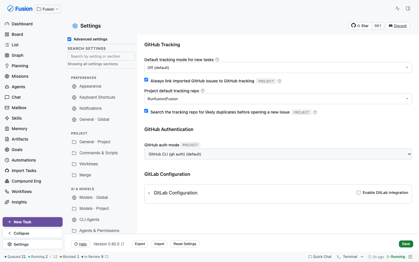 Key ownership moved with them in `section-keys.ts` / `save-split.ts`, so every key has exactly one owner (`section-keys.test.ts` enforces disjointness). **A latent bug surfaced by the move:** nine sites outside the registries hardcode `"global-general"`/`"general"` and silently gate **scope routing** — four in `save-split.ts`, five in `SettingsModal.tsx`. Left stale, global GitLab edits would have been written as project overrides. Also verified against the schema: **all five `gitlab*` keys AND `githubTrackingDefaultRepo`** are declared in both defaults (more than the four originally identified), so those rows carry no scope badge rather than assert a scope the data model can't support. ## Help moved behind a "?" beside every label Rendering every description inline turned dense sections into walls of prose — median help is ~100 chars, some past 400. That pressure is what made Merge invent its own "More details" disclosure, so one section showed two idioms. Measured across sections, Merge's help was **not** unusually long (median 103 vs Appearance's 168, which rendered inline), so the disclosure wasn't earning its keep. The copy is deferred **visually, not removed**: the bubble is always rendered and only fades in, so it stays in the accessibility tree for `aria-describedby`, stays findable with in-page find, and **the search index keeps matching on help text**. Errors are never deferred — a validation message you must hunt for is one you won't see. Only ~24 of 136 `<small>` blocks were actually row help. The rest stay inline on purpose and aren't help: validation errors, live status, empty-state explanations, per-option descriptions inside a multi-select, and copy explaining *why* a control is disabled. `children: ReactNode` (not a string) is what let the `<code>`-bearing and link-bearing rows migrate without rewording your copy — a string API is precisely why they were hand-rolled before. ### Mobile, verified on a 390px viewport 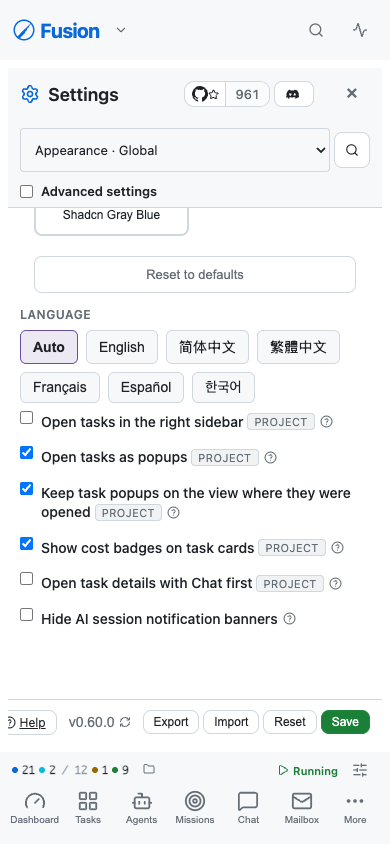 Driving a real phone-sized viewport caught two bugs that neither jsdom nor code review did: - **Bubble rendered off-screen.** The label line reads "Name [scope] ?", so the "?" sits well right of centre; anchored to the trigger, the bubble spanned x=338→658 against a 390px screen — 268px unreachable. `max-width` clamps width but can't help when the *anchor* is near the edge. It now anchors to the row (`inset-inline: 0`): re-measured at x=20→370 inside 390. An earlier comment claimed this behaviour; only the comment existed. - **Two bubbles open at once.** Outside-`pointerdown` dismissal misses a path: `click` fires with **no pointer event** when Enter/Space activates a focused trigger, so a keyboard user opening a second tip left the first open underneath. Tips now broadcast on open and close each other; the regression test asserts the bare-click path specifically. Also verified on touch: tapping outside dismisses, and opening a second tip closes the first — no stranded bubbles. **Checkbox wrapping.** On a 390px viewport a long label ("Keep task popups on the view where they were opened") stranded its checkbox alone on line 1, with the text on lines 2-3 and the badge on line 4. The head was a flex row and the label was a flex ITEM, so once it no longer fit beside the checkbox the whole label wrapped rather than its text. Label + badge + tip now form one group that absorbs the wrapping, leaving the checkbox as the only sibling item; continuation lines align under the first word. Audited every checkbox and radio on all 31 screens at 390px afterwards: **101 controls, all on the first line of their label text.** (The audit's first pass flagged 41 — all false positives from measuring `<label>` elements whose text is a bare text node, i.e. the label box included the checkbox. Re-measuring the text nodes themselves via Range cleared them.) ### Every row, including the ones that stayed bespoke Merge was the last holdout — 18 `<details>` "More details" disclosures plus 4 inline blocks, an idiom it invented and no other section used. All 22 now use the same "?":  Project Models likewise rendered lane help as prose while the global lanes next door already used the tip; its help now hangs on the existing lane label row beside the Override/Inherited badge (the badge is live state and stays visible; the fallback chain behind it is what you open deliberately). **Audited all 31 screens programmatically** (label treatments, control padding, row overflow, leftover banners, horizontal scroll): - **one label treatment on every screen**, one control treatment, zero overflowing rows, zero banners, no horizontal scroll - the copy still rendered inline is deliberately not row help: validation errors, live status, block descriptions, per-option text inside multi-selects, and copy explaining *why* a control is disabled **Known gap:** the three plugin runtime screens (Hermes / OpenClaw / Paperclip) still render inline help. They delegate to `HermesRuntimeCard` / `OpenClawRuntimeCard` / `PaperclipRuntimeCard` — separate card components outside the settings tree — and their copy *is* genuine row help ("Leave blank to resolve hermes from your PATH"). They are advanced-only and were left out of this pass rather than swept in at the end without review. ## Padding and label consistency (measured, not eyeballed) Two idioms were still visible on one screen — Merge rendered "PLAN APPROVAL MODE" in caps directly above "Auto-merge conflict retries" in sentence case. Rows that deliberately stay bespoke inherited the global `.form-group label` treatment. | | Before | After | |---|---|---| | Label treatments | uppercase/muted/11.5px **and** sentence/14px | **70 labels, one treatment** | | Control padding | `6px 10px` **and** `8px 12px` | **81 controls, one treatment** | | Row gaps | 12 / 16 / 20 by adjacency | **0** — every row owns its space | The cause was a specificity trap: `.form-group input` (0,1,1) out-specifies `.input` (0,1,0), so naming the standard class on a nested control did nothing. Fixed settings-scoped; the global `.form-group` is untouched (35 non-settings files depend on it, where uppercase is that context's convention). ## Advanced settings toggle — verified Confirmed in-browser after the regroup: **OFF → 15 sections / 5 groups; ON → 31 sections / 7 groups**, `data-show-advanced` flips, preference persists. The now-empty **Infrastructure and Advanced group headers are correctly hidden** when off — the case the regroup could have broken, since those groups contain only advanced sections. ## Pre-existing failures found (verified NOT caused by this PR) Each verified by running the identical file on the parent commit and diffing the **failure sets**, not just the counts: | Failure | Verified | |---|---| | `SettingsModal.scheduling-merge.test.tsx` — 55 failures | identical set before/after | | `SettingsModal.remote-notifications.test.tsx` — 16 failures | identical set before/after | | `settings-default-descriptions.test.tsx` — `sqliteMigrationNotice`, `postgresMigrationInboxMessageSentAt` | fails on clean tree | | i18n `parity.test.ts` — 12 violations (`settings.general.autoTranslate*`, `taskDetail.plan.*`) | 12 before, 12 after | **This PR adds zero new failures.** Fixed along the way: a stale `AppearanceSection` assertion testing copy FN-7945 deliberately rewrote (failing silently), the ungrammatical "1 matching sections", and `“` rendering literally on screen. ## Verification - `tsc --noEmit -p tsconfig.app.json` → **0 errors** (note: the default `tsconfig.json` only covers `src/` and does **not** typecheck `app/`) - `pnpm test:gate` → **63 passed** - Settings surface → 68 failures, every one a verified subset of the pre-existing baseline, diffed by failure SET not count (this branch incidentally fixes 4) - `pnpm test:gate` 63/63 · lint clean across 83 changed files · `tsc -p tsconfig.app.json` 0 errors - Rebased onto `main`: conflicts with #2147 and FN-8016 resolved - Driven in a real browser at 1440px and 390px: search, jump-to-field, help tips, advanced toggle, and every migrated section - Driven in a real browser: search, jump-to-field, highlight, and every migrated section 🤖 Generated with [Claude Code](https://claude.com/claude-code) <!-- This is an auto-generated comment: release notes by coderabbit.ai --> ## Summary by CodeRabbit * **New Features** * Settings search now indexes individual settings controls, ranks matches, and navigates directly to the exact row with a temporary highlight. * **UI Improvements** * Migrated settings sections to shared row primitives (toggle/select/number/text/textarea) for consistent spacing and touch-friendly controls. * Updated typography to a complete tokenized type scale; added the “?” help tip and tokenized row highlight/error styling. * Navigation and search labels now show clear Global vs Project scope. * **Bug Fixes** * Improved search accuracy using label/help/keywords and fixed settings search counts/pluralization and MCP scope labels. * **Tests** * Added/updated checks to ensure the settings search index stays consistent with rendered rows. <!-- end of auto-generated comment: release notes by coderabbit.ai --> --------- Co-authored-by: Claude Opus 4.8 (1M context) <noreply@anthropic.com>













386 lines
7.5 KiB
CSS
386 lines
7.5 KiB
CSS
/* FNXC:SettingsStyling 2026-07-15-17:35: This panel had drifted to six ad-hoc sizes (0.6/0.65/0.7/0.72/0.75rem) with no scale. Dense metadata (ids, sub-labels, customized badges) now names --font-size-2xs and tab/group/empty copy names --font-size-xs, so the panel has two deliberate rungs rather than six accidental ones. */
|
|
/* WorkflowSettingsPanel (U6 / KTD-1/KTD-2) — sibling of the fields/column panels.
|
|
* Mirrors .wf-fields-panel layout so the panels read side-by-side; adds an
|
|
* internal tab pair (Definitions / Values). Design tokens only; animations use
|
|
* --duration-* and muted text uses --text-muted. */
|
|
|
|
/* Wrapper div carries the scroll-into-view ref for `?panel=settings` deep links;
|
|
* it must not interfere with the editor's flex-row panel layout. */
|
|
.wf-settings-panel-wrap {
|
|
display: flex;
|
|
min-height: 0;
|
|
}
|
|
|
|
.wf-settings-panel {
|
|
display: flex;
|
|
flex-direction: column;
|
|
gap: var(--space-sm);
|
|
width: 320px;
|
|
min-width: 300px;
|
|
padding: var(--space-md);
|
|
border-left: 1px solid var(--border);
|
|
overflow-y: auto;
|
|
color: var(--text);
|
|
}
|
|
|
|
.wf-settings-panel-header {
|
|
display: flex;
|
|
align-items: center;
|
|
justify-content: space-between;
|
|
}
|
|
|
|
.wf-settings-tabs {
|
|
display: flex;
|
|
gap: 2px;
|
|
border-bottom: 1px solid var(--border);
|
|
}
|
|
|
|
.wf-settings-tab {
|
|
flex: 1;
|
|
padding: 6px 8px;
|
|
font-size: var(--font-size-xs);
|
|
background: none;
|
|
border: none;
|
|
border-bottom: 2px solid transparent;
|
|
color: var(--text-muted);
|
|
cursor: pointer;
|
|
transition: color var(--duration-fast) ease, border-color var(--duration-fast) ease;
|
|
}
|
|
|
|
.wf-settings-tab.is-active {
|
|
color: var(--text);
|
|
border-bottom-color: var(--accent, #4f7cff);
|
|
}
|
|
|
|
.wf-settings-tabpanel {
|
|
display: flex;
|
|
flex-direction: column;
|
|
gap: var(--space-sm);
|
|
}
|
|
|
|
.wf-settings-tabpanel-head {
|
|
display: flex;
|
|
align-items: center;
|
|
justify-content: flex-end;
|
|
}
|
|
|
|
.wf-settings-add,
|
|
.wf-settings-save-values,
|
|
.wf-settings-option-add {
|
|
display: inline-flex;
|
|
align-items: center;
|
|
gap: 4px;
|
|
}
|
|
|
|
.wf-settings-empty {
|
|
font-size: var(--font-size-xs);
|
|
color: var(--text-muted);
|
|
margin: 0;
|
|
}
|
|
|
|
.wf-settings-note {
|
|
display: flex;
|
|
align-items: center;
|
|
gap: 4px;
|
|
margin: 0;
|
|
font-size: var(--font-size-2xs);
|
|
}
|
|
|
|
.wf-settings-note--info {
|
|
color: var(--text-muted);
|
|
}
|
|
|
|
.wf-settings-note--muted {
|
|
color: var(--text-muted);
|
|
}
|
|
|
|
.wf-settings-note--warn {
|
|
color: var(--ws-warning, #f59e0b);
|
|
}
|
|
|
|
/* ── Definitions list ── */
|
|
|
|
.wf-settings-list {
|
|
list-style: none;
|
|
margin: 0;
|
|
padding: 0;
|
|
display: flex;
|
|
flex-direction: column;
|
|
gap: var(--space-sm);
|
|
}
|
|
|
|
.wf-setting-item {
|
|
border: 1px solid var(--border);
|
|
border-radius: var(--radius-md);
|
|
padding: var(--space-sm);
|
|
display: flex;
|
|
flex-direction: column;
|
|
gap: var(--space-xs);
|
|
}
|
|
|
|
.wf-setting-item-head {
|
|
display: flex;
|
|
align-items: center;
|
|
gap: var(--space-xs);
|
|
}
|
|
|
|
.wf-setting-name {
|
|
flex: 1;
|
|
min-width: 0;
|
|
}
|
|
|
|
.wf-setting-id-row {
|
|
display: flex;
|
|
align-items: center;
|
|
flex-wrap: wrap;
|
|
gap: var(--space-xs);
|
|
}
|
|
|
|
.wf-setting-id-static {
|
|
font-family: var(--font-mono, monospace);
|
|
font-size: var(--font-size-2xs);
|
|
color: var(--text-muted);
|
|
background: var(--surface-2, color-mix(in srgb, #ffffff 4%, transparent));
|
|
padding: 1px 6px;
|
|
border-radius: var(--radius-sm);
|
|
}
|
|
|
|
.wf-setting-id-edit {
|
|
font-size: var(--font-size-2xs);
|
|
background: none;
|
|
border: none;
|
|
color: var(--accent, #4f7cff);
|
|
cursor: pointer;
|
|
padding: 0;
|
|
}
|
|
|
|
.wf-setting-id-warn {
|
|
display: flex;
|
|
align-items: center;
|
|
gap: 4px;
|
|
width: 100%;
|
|
margin: 0;
|
|
font-size: var(--font-size-2xs);
|
|
color: var(--ws-warning, #f59e0b);
|
|
}
|
|
|
|
.wf-setting-row {
|
|
display: flex;
|
|
align-items: flex-end;
|
|
gap: var(--space-sm);
|
|
}
|
|
|
|
.wf-setting-sub {
|
|
display: flex;
|
|
flex-direction: column;
|
|
gap: 2px;
|
|
flex: 1;
|
|
min-width: 0;
|
|
font-size: var(--font-size-2xs);
|
|
color: var(--text-muted);
|
|
}
|
|
|
|
.wf-setting-sub > span {
|
|
font-size: var(--font-size-2xs);
|
|
text-transform: uppercase;
|
|
color: var(--text-muted);
|
|
}
|
|
|
|
.wf-setting--checkbox {
|
|
display: inline-flex;
|
|
align-items: center;
|
|
gap: 4px;
|
|
font-size: var(--font-size-2xs);
|
|
color: var(--text-muted);
|
|
}
|
|
|
|
/*
|
|
FNXC:WorkflowEditorTheme 2026-06-19-05:22:
|
|
Boolean workflow settings live in the editor's left sidebar, so their checkboxes must use the same accent token as inspector checkboxes instead of browser-default white controls.
|
|
*/
|
|
.wf-setting--checkbox input[type="checkbox"] {
|
|
accent-color: var(--todo);
|
|
}
|
|
|
|
.wf-setting-options {
|
|
display: flex;
|
|
flex-direction: column;
|
|
gap: var(--space-xs);
|
|
padding-top: var(--space-xs);
|
|
border-top: 1px dashed var(--border);
|
|
}
|
|
|
|
.wf-setting-options-label {
|
|
font-size: var(--font-size-2xs);
|
|
text-transform: uppercase;
|
|
color: var(--text-muted);
|
|
}
|
|
|
|
.wf-setting-option-row {
|
|
display: flex;
|
|
align-items: center;
|
|
gap: 4px;
|
|
}
|
|
|
|
.wf-setting-option-value,
|
|
.wf-setting-option-label {
|
|
flex: 1;
|
|
min-width: 0;
|
|
}
|
|
|
|
.wf-setting-option-colors {
|
|
display: inline-flex;
|
|
gap: 2px;
|
|
}
|
|
|
|
.wf-setting-color-swatch {
|
|
width: 14px;
|
|
height: 14px;
|
|
border-radius: 50%;
|
|
border: 1px solid var(--border);
|
|
padding: 0;
|
|
cursor: pointer;
|
|
}
|
|
|
|
.wf-setting-color-swatch.is-active {
|
|
outline: 2px solid var(--text);
|
|
outline-offset: 1px;
|
|
}
|
|
|
|
/* ── Values tab ── */
|
|
|
|
.wf-settings-values-head {
|
|
display: flex;
|
|
align-items: center;
|
|
justify-content: flex-end;
|
|
}
|
|
|
|
.wf-settings-values-list {
|
|
display: flex;
|
|
flex-direction: column;
|
|
gap: var(--space-md);
|
|
}
|
|
|
|
.wf-settings-value-group {
|
|
display: flex;
|
|
flex-direction: column;
|
|
gap: var(--space-xs);
|
|
}
|
|
|
|
.wf-settings-value-group-title {
|
|
margin: 0;
|
|
font-size: var(--font-size-xs);
|
|
color: var(--text-muted);
|
|
text-transform: uppercase;
|
|
letter-spacing: 0;
|
|
}
|
|
|
|
.wf-settings-value-item {
|
|
position: relative;
|
|
display: flex;
|
|
flex-direction: column;
|
|
gap: 2px;
|
|
}
|
|
|
|
.wf-settings-customized {
|
|
align-self: flex-start;
|
|
font-size: var(--font-size-2xs);
|
|
text-transform: uppercase;
|
|
letter-spacing: 0.04em;
|
|
color: var(--accent, #4f7cff);
|
|
}
|
|
|
|
.wf-settings-reset-hint {
|
|
display: flex;
|
|
align-items: center;
|
|
gap: 4px;
|
|
margin: 0;
|
|
font-size: var(--font-size-2xs);
|
|
color: var(--text-muted);
|
|
}
|
|
|
|
/* ── Orphaned disclosure ── */
|
|
|
|
.wf-settings-orphaned {
|
|
border-top: 1px dashed var(--border);
|
|
padding-top: var(--space-xs);
|
|
}
|
|
|
|
.wf-settings-orphaned-toggle {
|
|
display: inline-flex;
|
|
align-items: center;
|
|
gap: 4px;
|
|
background: none;
|
|
border: none;
|
|
color: var(--text-muted);
|
|
font-size: var(--font-size-xs);
|
|
cursor: pointer;
|
|
padding: 0;
|
|
}
|
|
|
|
.wf-settings-orphaned-body {
|
|
display: flex;
|
|
flex-direction: column;
|
|
gap: var(--space-xs);
|
|
padding-top: var(--space-xs);
|
|
}
|
|
|
|
.wf-settings-orphaned-list {
|
|
list-style: none;
|
|
margin: 0;
|
|
padding: 0;
|
|
display: flex;
|
|
flex-direction: column;
|
|
gap: 4px;
|
|
}
|
|
|
|
.wf-settings-orphaned-row {
|
|
display: flex;
|
|
align-items: center;
|
|
gap: var(--space-xs);
|
|
}
|
|
|
|
.wf-settings-orphan-id {
|
|
font-family: var(--font-mono, monospace);
|
|
font-size: var(--font-size-2xs);
|
|
color: var(--text-muted);
|
|
}
|
|
|
|
.wf-settings-orphan-value {
|
|
flex: 1;
|
|
min-width: 0;
|
|
font-size: var(--font-size-2xs);
|
|
color: var(--text-muted);
|
|
overflow: hidden;
|
|
text-overflow: ellipsis;
|
|
white-space: nowrap;
|
|
}
|
|
|
|
.wf-settings-orphan-delete {
|
|
background: none;
|
|
border: none;
|
|
color: var(--text-muted);
|
|
cursor: pointer;
|
|
padding: 0;
|
|
}
|
|
|
|
@media (max-width: 768px) {
|
|
.wf-settings-panel-wrap {
|
|
flex-direction: column;
|
|
}
|
|
|
|
.wf-settings-panel {
|
|
width: 100%;
|
|
min-width: 0;
|
|
padding: var(--space-sm);
|
|
border-left: none;
|
|
border-top: 1px solid var(--border);
|
|
}
|
|
|
|
.wf-setting-row,
|
|
.wf-setting-option-row,
|
|
.wf-settings-orphaned-row {
|
|
flex-wrap: wrap;
|
|
}
|
|
}
|