 55745af80f
Settings had three compounding problems: you couldn't find a setting, and once you found it, it didn't look like its neighbour. ## Organization — the nav was grouped by the wrong thing It was grouped by **scope** (Global / Runtimes / Project). Scope is an *attribute* of a setting, not a category — nobody opens Settings thinking "I need a project-authority setting." That single choice split five concepts across two groups, including **two nav entries both labelled "MCP Servers"**, distinguishable only by a small icon. Now grouped by topic, with paired sections adjacent and stating their own scope: 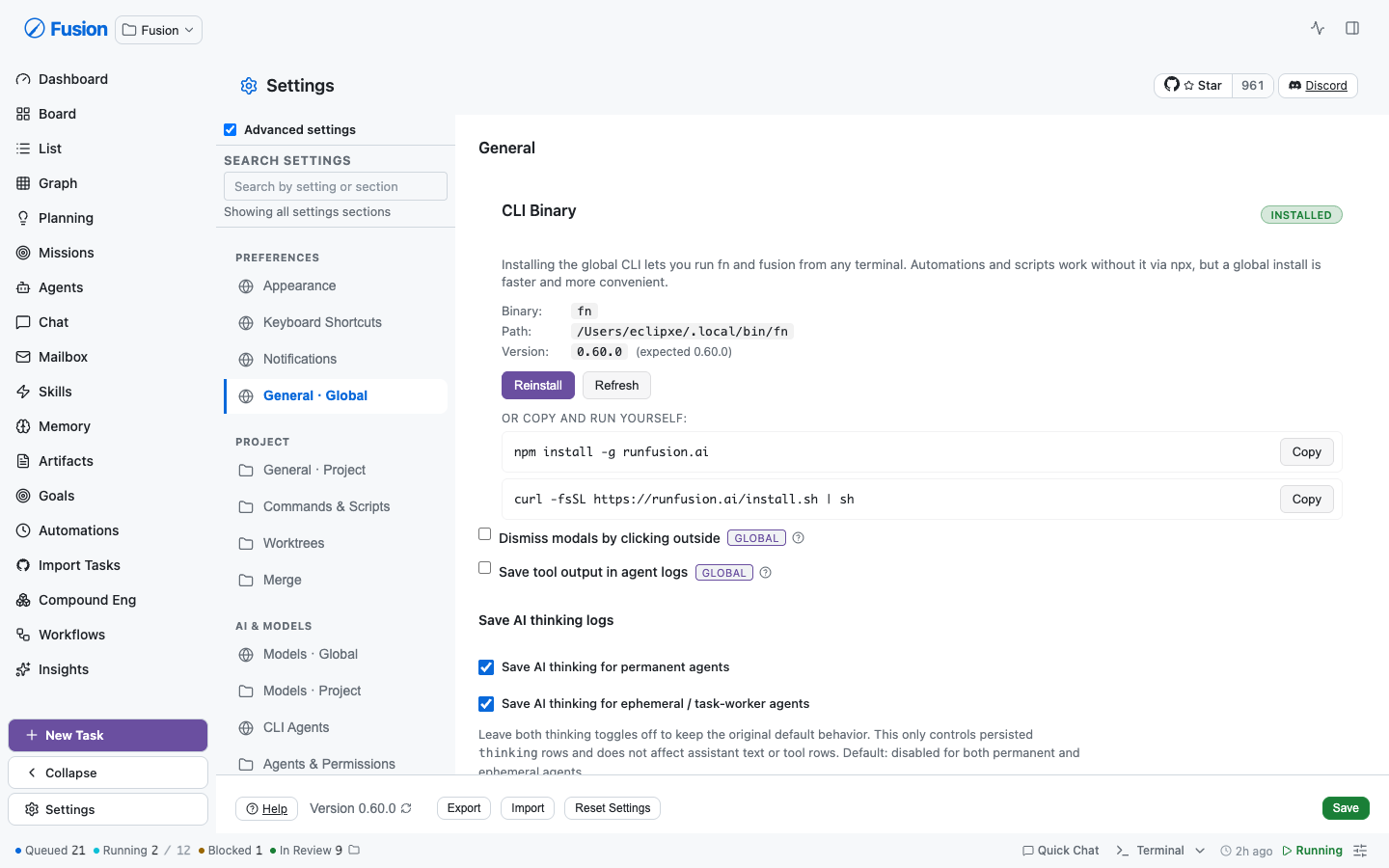 ``` PREFERENCES Appearance · Keyboard Shortcuts · Notifications · General · Global PROJECT General · Project · Commands & Scripts · Worktrees · Merge AI & MODELS Models · Global · Models · Project · CLI Agents · Agents & Permissions · Prompts · Memory AUTOMATION Scheduling & Capacity · Scheduled Evals INTEGRATIONS Authentication · MCP Servers · Global · MCP Servers · Project · Plugins · Runtimes · Secrets INFRASTRUCTURE Node Sync · Node Routing · Remote Access · Backups ADVANCED Experimental Features ``` ## Search — it now finds settings, not just sections Search matched only hand-written `searchableText` keyword arrays per nav entry, and those demonstrably rotted: Project Models accumulated 20 keywords across **two separate fixes** (FN-7907, then title-summarization on 2026-07-14) because operators searched "summarize" and got nothing. Every setting is now indexed from **its real label and help text** — 123 settings across 18 sections, zero curated keywords. The same query that was patched twice by hand: 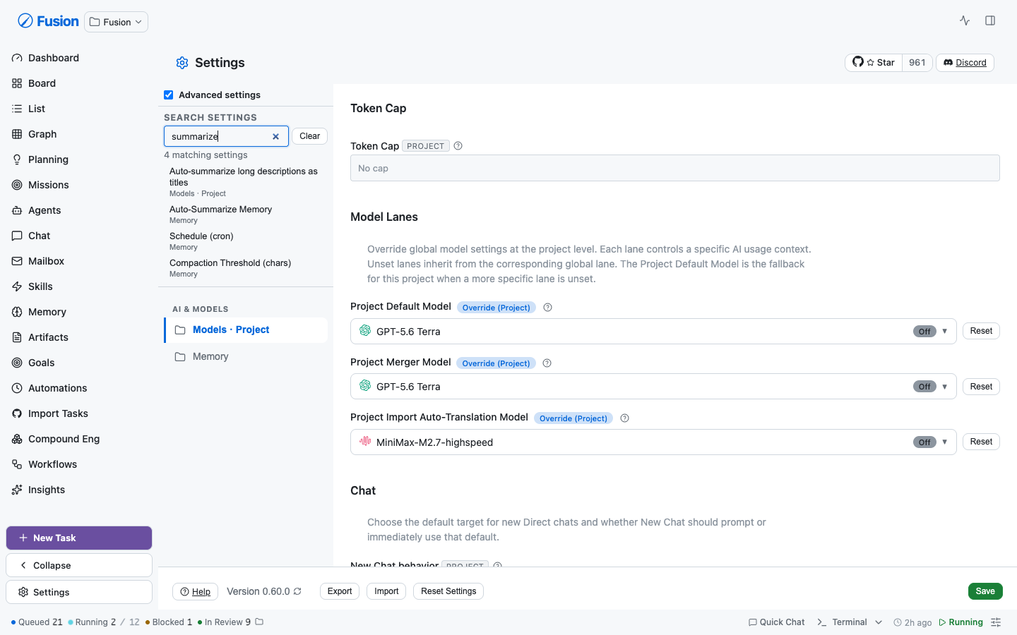 Two of those four hits match on *help text*, which a keyword index structurally cannot do. Picking a result jumps to the exact control, **opens its collapsed disclosure**, and highlights it: 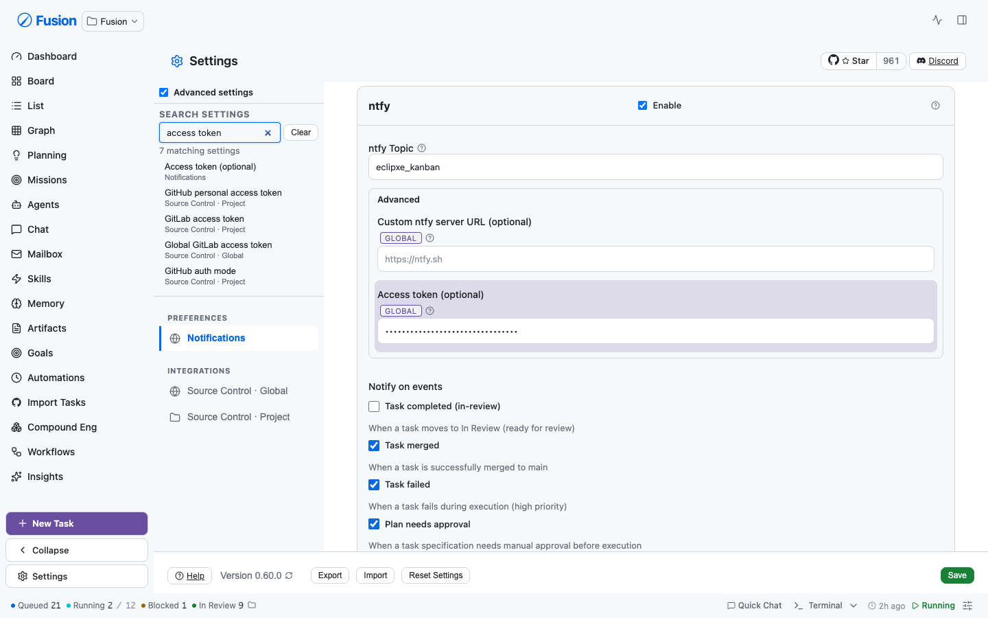 **This can't rot again.** `settings-search-index.test.ts` extracts every `descriptor={{ key }}` from section sources and fails the build if one isn't indexed. "All settings are searchable" is an enforced invariant, not a promise. ## Consistency — one type scale A text field's label and a toggle's label in the same section were styled **three different ways**: `.form-group label` (12px/600/uppercase/muted), a `.settings-content` override narrowing it to 0.72rem, and `.checkbox-label` (13px/500/sentence-case) whose every declaration carried `!important` purely to out-specify the other two. | | Before | After | |---|---|---| | Sections on shared primitives | 1 | **18** | | Indexed searchable settings | 0 | **123** | | `form-group` in settings | 226 | **98** | | `checkbox-label` in settings | 79 | **40** | 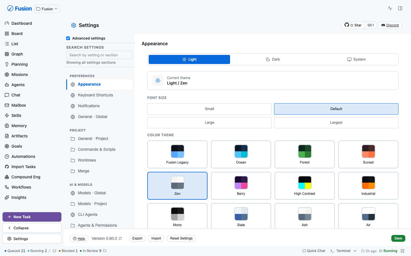 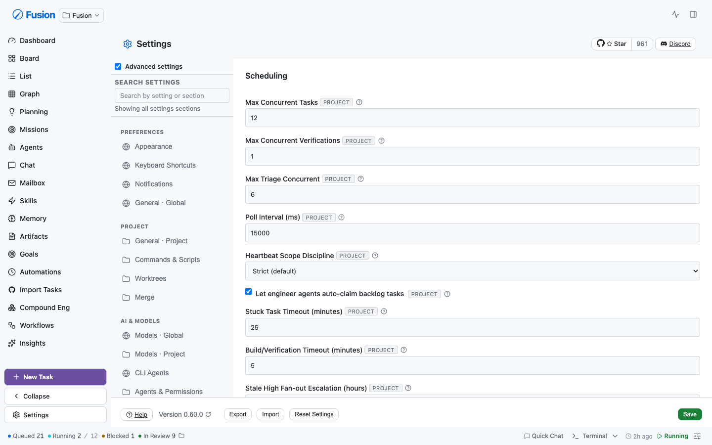 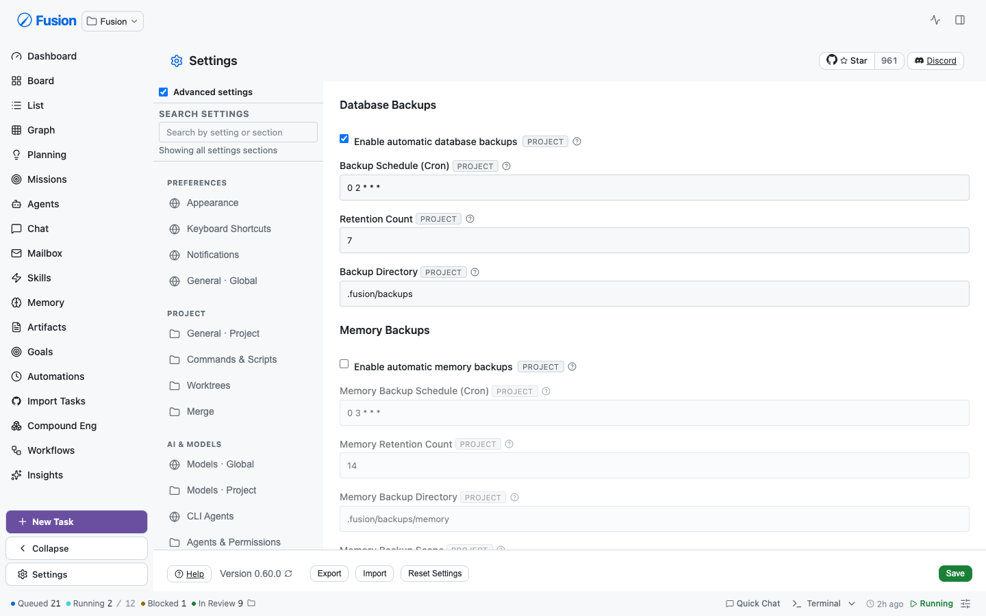 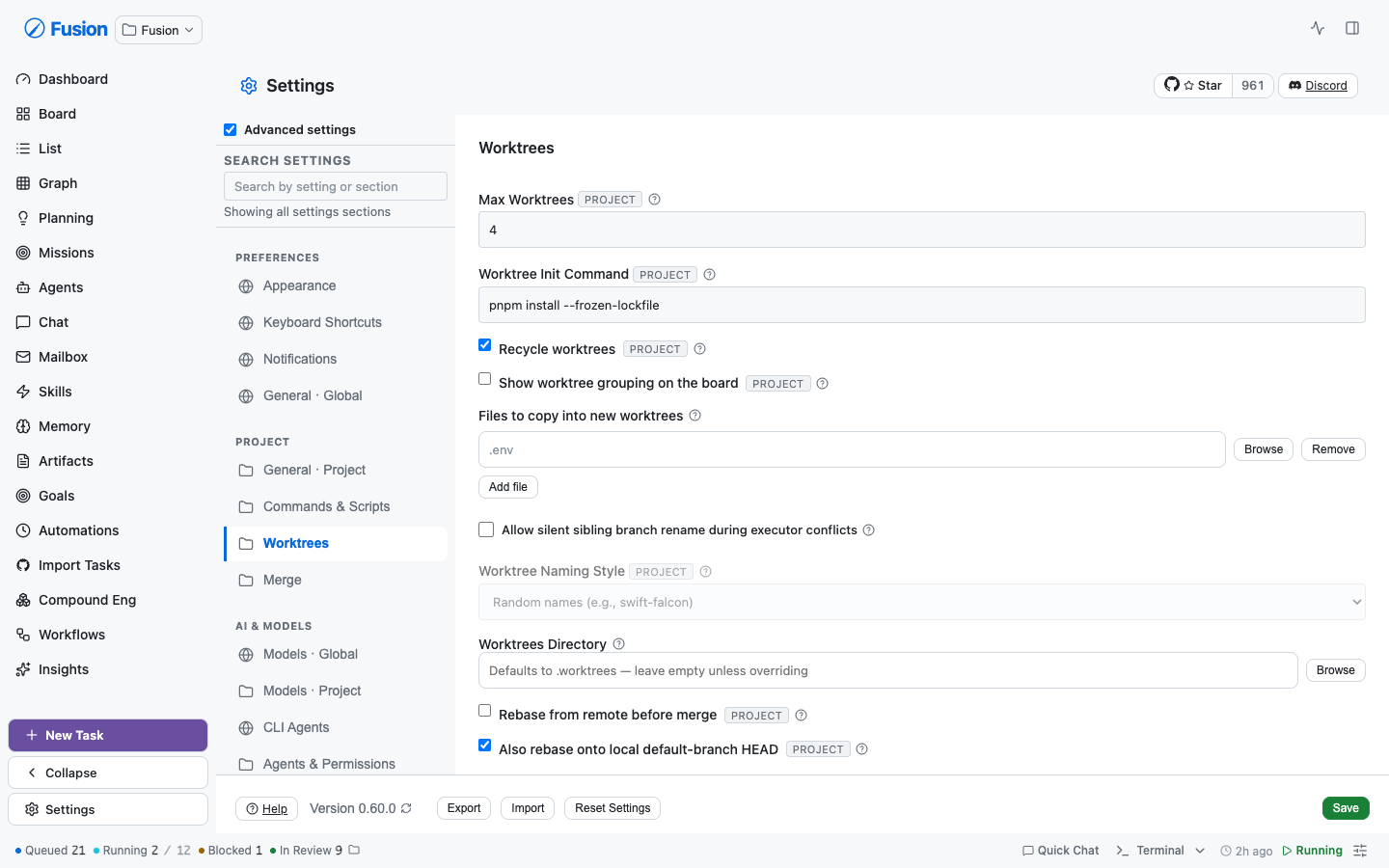 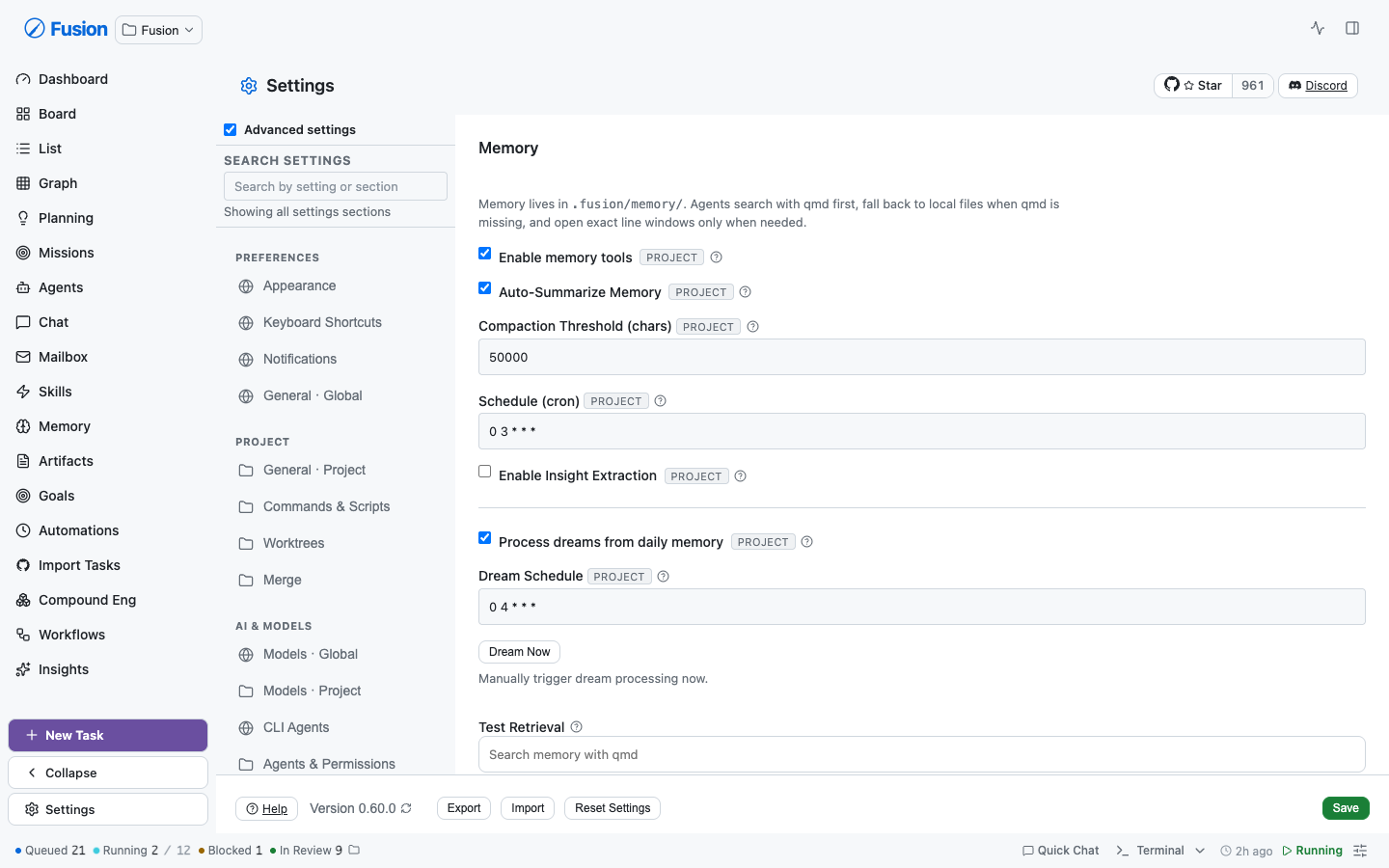 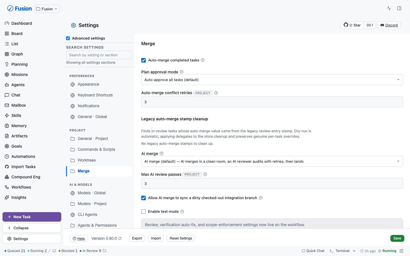 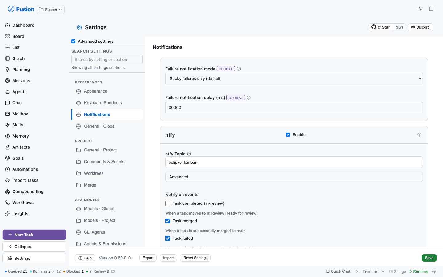 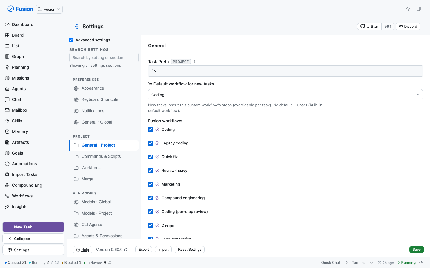 **Global `.form-group` is untouched** — 35 non-settings files style forms with it, so settings migrate *off* it rather than restyle it underneath the rest of the dashboard. ### A real latent bug this surfaced `--font-size-sm` and `--font-size-md` were named by **12 declarations** across AgentDetailView, DockTaskList, SetupWizardModal, and ModelOnboardingModal — but **defined nowhere**. Those rules silently no-op'd and inherited. The command-center token guard is the only thing that catches this class of omission and it doesn't cover those files. The scale is now complete (`2xs · xs · sm · base · md · lg`); `md` is 1.125rem to hold current rendering, since unstyled `h3` already inherits the 1.17em UA default. ## What deliberately did *not* migrate Some rows stay bespoke **on purpose**, not from incompleteness: - **Password fields** (`ntfyAccessToken`, `githubAuthToken`, `gitlabAuthToken`) — `SettingsTextRow` hardcodes `type="text"`, so migrating would have **rendered stored tokens unmasked**. - **Help text with embedded `<code>`/links** — `descriptor.help` is a single string; flattening would drop markup or reword copy. - **`<details>` progressive disclosure** in Merge — a descriptor's help renders unconditionally, so migrating ~10 rows would delete the disclosure and produce a wall of prose. - **Dynamic flag lists** (Experimental) and bespoke editors/CRUD (Prompts, Agents & Permissions, Plugins, KeyboardShortcuts' capture widget) — no settings field name and no i18n key to anchor honestly. ## Data-model ambiguities surfaced (not papered over) These need a human call and are **not** fixed here: - **Five keys are declared in BOTH `DEFAULT_GLOBAL_SETTINGS` and `DEFAULT_PROJECT_SETTINGS`**: `worktrunk`, `testMode`, `gitlabEnabled`, `gitlabAuthToken`, `gitlabAuthTokenType`. No scope badge can be stamped honestly, so those rows are left bespoke. - **`globalMaxConcurrent` lives in the *project* blob** despite its name, its dedicated global endpoint, and the "Global" header it renders under. Its badge is omitted rather than assert a contradiction. - **Two settings were editable from two screens**: `gitlabEnabled` (General + Merge) and `githubTrackingDefaultRepo` (General + Global General). Both are ambiguous-scope and custom widgets, so deduplication is left as follow-up. ## Follow-ups from review **`SettingsTextRow` gained `type`, so the token rows could migrate.** It hardcoded `type="text"`, which is why every secret-bearing row (ntfy access token, GitHub/GitLab tokens, the Cloudflare tunnel token) stayed hand-rolled — migrating would have rendered stored secrets in plain text. `password` rows now default to `autocomplete="off"` so a browser never offers to save an API token, and masking is pinned by tests: a regression there would not throw and would not look wrong in review, the field would simply render the token. That also made them findable. Searching "token" previously matched nothing useful; it now returns 9 settings including *Access token* and *Tunnel token*: **Jump-to-field now reveals collapsed disclosures.** Rows inside a closed `<details>` are in the DOM but invisible, so the jump scrolled to and highlighted a control the operator could not see. The settings most worth searching for are exactly the ones behind "Advanced". **The scope banner is gone.** It claimed one scope for a whole section, which was false wherever a section mixed them — Appearance is a "global" nav entry whose task-presentation toggles are all project-scoped. Per-row badges already say this accurately, so the banner and its dead CSS are removed. **Scheduling is split by scope.** `globalMaxConcurrent` moved to its own `Scheduling · Global` section instead of sitting above the project settings behind an in-section subheading. One section held two authority levels, so "does this affect my other projects?" depended on which subheading you had scrolled past — and a search result landing mid-section shows no subheading at all.  **Text-entry padding is now genuinely uniform.** Settings shipped two input treatments: `.input`/`.select` (6px 10px at 13px) and the global `.form-group input` rule (8px 12px at 14px). Padding depended on whether an ancestor happened to be a `.form-group`, and because `.form-group input` (0,1,1) out-specifies `.input` (0,1,0), naming the standard class on a nested control did nothing. Measured in-browser after the fix: **51 controls across four sections, one appearance, zero outliers.** The same specificity trap was silently re-imposing the uppercase/muted label treatment on migrated rows nested in a `.form-group`; fixed as an invariant rather than per-row, since sections legitimately keep `.form-group` around bespoke content. ## Reconciling with #2147 (please review this call) PR #2147 landed while this branch was open and deliberately moved the two import auto-translate controls **off** `SettingsToggleRow` onto `checkbox-label`, pinning that markup with a test written to survive *"a refactor back onto the primitive"*. Its objection was that the primitive rendered a right-aligned toggle switch clashing with the section's native checkboxes — two idioms in one section. Both halves of that objection are now gone: the primitive renders a native checkbox **before** its label, and every checkbox in that section — including the neighbour the test asserts parity against — renders through it. The idiom split is resolved by migrating all of them rather than de-migrating these two, so the markup assertions now track the primitive. **Every behavioural contract from #2147 is kept and still pinned**, and one was a real bug on this branch: switching auto-translate off wrote `false` where it must write `undefined`, leaving an explicit opt-out in the settings blob instead of staying unset. #2147's curated translate keywords are preserved for the genuine vocabulary gaps ("localize", "localization", "foreign language issues") that appear in no copy. FN-8016's rewritten `taskPopupsBoardListOnly` copy (default now enabled) is adopted into the migrated row and its search entry. Worth noting: #2147's own FNXC says the translate controls were *"effectively unfindable"* because *"settings search only matches curated terms plus advertised i18n keys"* — 25 keywords hand-added days ago. That is precisely the rot this PR's derived index removes. ## Source Control — the duplicate had a cause GitLab settings were split across **three** sections (General: enable + URLs; Merge: auth token + type; Global General: all five at global scope) and GitHub across two. That split is *why* `gitlabEnabled` ended up writable from both General and Merge — two enable toggles for one key, last-save-wins. A `Source Control · Global` / `· Project` pair now owns all 17 keys, adjacent under Integrations, with **one** GitLab disclosure and **one** enable toggle: 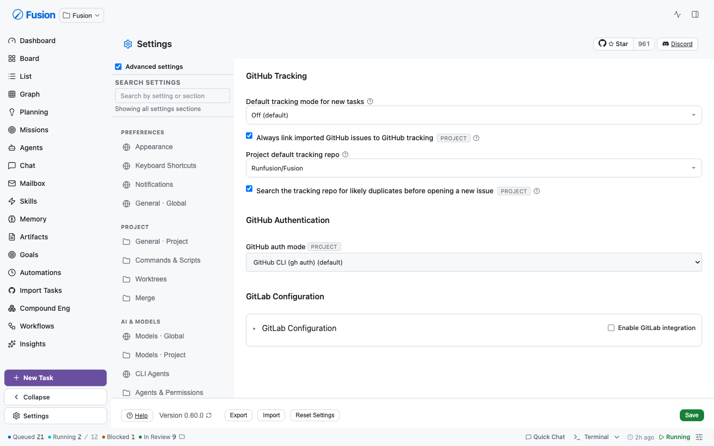 Key ownership moved with them in `section-keys.ts` / `save-split.ts`, so every key has exactly one owner (`section-keys.test.ts` enforces disjointness). **A latent bug surfaced by the move:** nine sites outside the registries hardcode `"global-general"`/`"general"` and silently gate **scope routing** — four in `save-split.ts`, five in `SettingsModal.tsx`. Left stale, global GitLab edits would have been written as project overrides. Also verified against the schema: **all five `gitlab*` keys AND `githubTrackingDefaultRepo`** are declared in both defaults (more than the four originally identified), so those rows carry no scope badge rather than assert a scope the data model can't support. ## Help moved behind a "?" beside every label Rendering every description inline turned dense sections into walls of prose — median help is ~100 chars, some past 400. That pressure is what made Merge invent its own "More details" disclosure, so one section showed two idioms. Measured across sections, Merge's help was **not** unusually long (median 103 vs Appearance's 168, which rendered inline), so the disclosure wasn't earning its keep. The copy is deferred **visually, not removed**: the bubble is always rendered and only fades in, so it stays in the accessibility tree for `aria-describedby`, stays findable with in-page find, and **the search index keeps matching on help text**. Errors are never deferred — a validation message you must hunt for is one you won't see. Only ~24 of 136 `<small>` blocks were actually row help. The rest stay inline on purpose and aren't help: validation errors, live status, empty-state explanations, per-option descriptions inside a multi-select, and copy explaining *why* a control is disabled. `children: ReactNode` (not a string) is what let the `<code>`-bearing and link-bearing rows migrate without rewording your copy — a string API is precisely why they were hand-rolled before. ### Mobile, verified on a 390px viewport 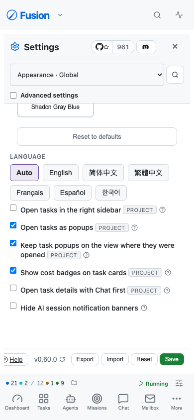 Driving a real phone-sized viewport caught two bugs that neither jsdom nor code review did: - **Bubble rendered off-screen.** The label line reads "Name [scope] ?", so the "?" sits well right of centre; anchored to the trigger, the bubble spanned x=338→658 against a 390px screen — 268px unreachable. `max-width` clamps width but can't help when the *anchor* is near the edge. It now anchors to the row (`inset-inline: 0`): re-measured at x=20→370 inside 390. An earlier comment claimed this behaviour; only the comment existed. - **Two bubbles open at once.** Outside-`pointerdown` dismissal misses a path: `click` fires with **no pointer event** when Enter/Space activates a focused trigger, so a keyboard user opening a second tip left the first open underneath. Tips now broadcast on open and close each other; the regression test asserts the bare-click path specifically. Also verified on touch: tapping outside dismisses, and opening a second tip closes the first — no stranded bubbles. **Checkbox wrapping.** On a 390px viewport a long label ("Keep task popups on the view where they were opened") stranded its checkbox alone on line 1, with the text on lines 2-3 and the badge on line 4. The head was a flex row and the label was a flex ITEM, so once it no longer fit beside the checkbox the whole label wrapped rather than its text. Label + badge + tip now form one group that absorbs the wrapping, leaving the checkbox as the only sibling item; continuation lines align under the first word. Audited every checkbox and radio on all 31 screens at 390px afterwards: **101 controls, all on the first line of their label text.** (The audit's first pass flagged 41 — all false positives from measuring `<label>` elements whose text is a bare text node, i.e. the label box included the checkbox. Re-measuring the text nodes themselves via Range cleared them.) ### Every row, including the ones that stayed bespoke Merge was the last holdout — 18 `<details>` "More details" disclosures plus 4 inline blocks, an idiom it invented and no other section used. All 22 now use the same "?":  Project Models likewise rendered lane help as prose while the global lanes next door already used the tip; its help now hangs on the existing lane label row beside the Override/Inherited badge (the badge is live state and stays visible; the fallback chain behind it is what you open deliberately). **Audited all 31 screens programmatically** (label treatments, control padding, row overflow, leftover banners, horizontal scroll): - **one label treatment on every screen**, one control treatment, zero overflowing rows, zero banners, no horizontal scroll - the copy still rendered inline is deliberately not row help: validation errors, live status, block descriptions, per-option text inside multi-selects, and copy explaining *why* a control is disabled **Known gap:** the three plugin runtime screens (Hermes / OpenClaw / Paperclip) still render inline help. They delegate to `HermesRuntimeCard` / `OpenClawRuntimeCard` / `PaperclipRuntimeCard` — separate card components outside the settings tree — and their copy *is* genuine row help ("Leave blank to resolve hermes from your PATH"). They are advanced-only and were left out of this pass rather than swept in at the end without review. ## Padding and label consistency (measured, not eyeballed) Two idioms were still visible on one screen — Merge rendered "PLAN APPROVAL MODE" in caps directly above "Auto-merge conflict retries" in sentence case. Rows that deliberately stay bespoke inherited the global `.form-group label` treatment. | | Before | After | |---|---|---| | Label treatments | uppercase/muted/11.5px **and** sentence/14px | **70 labels, one treatment** | | Control padding | `6px 10px` **and** `8px 12px` | **81 controls, one treatment** | | Row gaps | 12 / 16 / 20 by adjacency | **0** — every row owns its space | The cause was a specificity trap: `.form-group input` (0,1,1) out-specifies `.input` (0,1,0), so naming the standard class on a nested control did nothing. Fixed settings-scoped; the global `.form-group` is untouched (35 non-settings files depend on it, where uppercase is that context's convention). ## Advanced settings toggle — verified Confirmed in-browser after the regroup: **OFF → 15 sections / 5 groups; ON → 31 sections / 7 groups**, `data-show-advanced` flips, preference persists. The now-empty **Infrastructure and Advanced group headers are correctly hidden** when off — the case the regroup could have broken, since those groups contain only advanced sections. ## Pre-existing failures found (verified NOT caused by this PR) Each verified by running the identical file on the parent commit and diffing the **failure sets**, not just the counts: | Failure | Verified | |---|---| | `SettingsModal.scheduling-merge.test.tsx` — 55 failures | identical set before/after | | `SettingsModal.remote-notifications.test.tsx` — 16 failures | identical set before/after | | `settings-default-descriptions.test.tsx` — `sqliteMigrationNotice`, `postgresMigrationInboxMessageSentAt` | fails on clean tree | | i18n `parity.test.ts` — 12 violations (`settings.general.autoTranslate*`, `taskDetail.plan.*`) | 12 before, 12 after | **This PR adds zero new failures.** Fixed along the way: a stale `AppearanceSection` assertion testing copy FN-7945 deliberately rewrote (failing silently), the ungrammatical "1 matching sections", and `“` rendering literally on screen. ## Verification - `tsc --noEmit -p tsconfig.app.json` → **0 errors** (note: the default `tsconfig.json` only covers `src/` and does **not** typecheck `app/`) - `pnpm test:gate` → **63 passed** - Settings surface → 68 failures, every one a verified subset of the pre-existing baseline, diffed by failure SET not count (this branch incidentally fixes 4) - `pnpm test:gate` 63/63 · lint clean across 83 changed files · `tsc -p tsconfig.app.json` 0 errors - Rebased onto `main`: conflicts with #2147 and FN-8016 resolved - Driven in a real browser at 1440px and 390px: search, jump-to-field, help tips, advanced toggle, and every migrated section - Driven in a real browser: search, jump-to-field, highlight, and every migrated section 🤖 Generated with [Claude Code](https://claude.com/claude-code) <!-- This is an auto-generated comment: release notes by coderabbit.ai --> ## Summary by CodeRabbit * **New Features** * Settings search now indexes individual settings controls, ranks matches, and navigates directly to the exact row with a temporary highlight. * **UI Improvements** * Migrated settings sections to shared row primitives (toggle/select/number/text/textarea) for consistent spacing and touch-friendly controls. * Updated typography to a complete tokenized type scale; added the “?” help tip and tokenized row highlight/error styling. * Navigation and search labels now show clear Global vs Project scope. * **Bug Fixes** * Improved search accuracy using label/help/keywords and fixed settings search counts/pluralization and MCP scope labels. * **Tests** * Added/updated checks to ensure the settings search index stays consistent with rendered rows. <!-- end of auto-generated comment: release notes by coderabbit.ai --> --------- Co-authored-by: Claude Opus 4.8 (1M context) <noreply@anthropic.com>













3095 lines
80 KiB
CSS
3095 lines
80 KiB
CSS
/* FNXC:SettingsStyling 2026-07-15-17:35: Settings mixed px, rem, em, and calc()-over-spacing font sizes across ~10 distinct values with no scale. Declarations now name scale rungs by role — 2xs for badges/pills, xs for help and caption copy, sm for control labels and body, base/md for headings — so type is retuned from the token definitions rather than by sweeping this file. The mobile `font-size: 16px` overrides stay raw on purpose: they are iOS's focus-zoom threshold, not a type rung, and must hold at 16px even if the root font size shrinks. */
|
|
/* === SettingsModal: all settings-related layout, panel, and component styles ===
|
|
Extracted from styles.css as part of the Sweep-3 CSS extraction effort.
|
|
Imported by SettingsModal.tsx (and MemoryView.tsx for shared classes). */
|
|
|
|
/* === Settings Modal header action buttons (Star on GitHub, Discord) === */
|
|
.settings-header-actions {
|
|
--settings-header-action-height: calc(var(--space-md) * 2 + var(--space-xs) / 2);
|
|
|
|
display: flex;
|
|
align-items: stretch;
|
|
gap: var(--space-xs);
|
|
margin-left: auto;
|
|
margin-right: var(--space-sm);
|
|
}
|
|
|
|
/* Keep the GitHub Star and Help buttons at matching heights regardless of
|
|
their differing icon sizes (provider icon 16px vs. HelpCircle 13px). */
|
|
.settings-header-actions > .settings-github-star-btn,
|
|
.settings-header-actions > .settings-header-discord-btn {
|
|
height: var(--settings-header-action-height);
|
|
box-sizing: border-box;
|
|
}
|
|
|
|
.settings-header-discord-btn,
|
|
.settings-footer-help-btn {
|
|
display: inline-flex;
|
|
align-items: center;
|
|
}
|
|
|
|
@media (max-width: 768px) {
|
|
/* FN-4375: keep heading, actions, and close in one row on mobile; supersedes FN-4281/FN-4331/FN-4363 wrap/order behavior. */
|
|
.settings-modal .modal-header {
|
|
flex-wrap: nowrap;
|
|
align-items: center;
|
|
column-gap: var(--space-sm);
|
|
}
|
|
|
|
.settings-modal-heading {
|
|
flex: 1 1 0;
|
|
min-width: 0;
|
|
}
|
|
|
|
.settings-header-actions {
|
|
margin-left: auto;
|
|
margin-right: var(--space-sm);
|
|
}
|
|
|
|
/*
|
|
FNXC:Settings 2026-07-11-00:00:
|
|
FN-7848: Mobile Settings must still show the GitHub star count. FN-4375 kept the header in one row by collapsing promotional action labels; keep the count visible and rely on .settings-modal-heading min-width: 0 to truncate the title before the pill wraps. Only the redundant "Star" word stays collapsed to save horizontal room.
|
|
*/
|
|
.settings-header-actions .settings-github-star-btn__action,
|
|
.settings-header-actions .settings-header-discord-btn {
|
|
width: 40px;
|
|
min-width: 40px;
|
|
padding: 0;
|
|
justify-content: center;
|
|
font-size: 0;
|
|
}
|
|
|
|
.settings-header-actions .settings-github-star-btn__action {
|
|
gap: 0;
|
|
}
|
|
}
|
|
|
|
/* GitHub star button — split-pill layout: [Star half | Count half] */
|
|
.settings-github-star-btn {
|
|
display: inline-flex;
|
|
align-items: stretch;
|
|
border: var(--btn-border-width) solid var(--border);
|
|
border-radius: var(--radius-pill);
|
|
background: var(--card);
|
|
color: var(--text);
|
|
font-size: var(--font-size-xs);
|
|
font-weight: 500;
|
|
text-decoration: none;
|
|
overflow: hidden;
|
|
transition:
|
|
border-color var(--transition-fast),
|
|
background var(--transition-fast);
|
|
}
|
|
|
|
.settings-github-star-btn:hover {
|
|
border-color: var(--text-muted);
|
|
background: var(--card-hover);
|
|
}
|
|
|
|
.settings-github-star-btn:focus-visible {
|
|
outline: none;
|
|
box-shadow: var(--focus-ring-strong);
|
|
border-color: var(--todo);
|
|
}
|
|
|
|
.settings-github-star-btn__action {
|
|
display: inline-flex;
|
|
align-items: center;
|
|
gap: var(--space-xs);
|
|
padding: var(--space-xs) calc(var(--space-sm) + var(--space-xs) / 2);
|
|
}
|
|
|
|
.settings-github-star-btn__count {
|
|
display: inline-flex;
|
|
align-items: center;
|
|
padding: var(--space-xs) calc(var(--space-sm) + var(--space-xs) / 4);
|
|
border-left: var(--btn-border-width) solid var(--border);
|
|
background: color-mix(in srgb, var(--surface) 60%, var(--card));
|
|
color: var(--text-muted);
|
|
font-variant-numeric: tabular-nums;
|
|
}
|
|
|
|
/* === Settings Modal: sizing + resizability === */
|
|
.settings-modal {
|
|
width: min(95vw, 1100px);
|
|
max-width: 95vw;
|
|
min-width: 520px;
|
|
height: 80vh;
|
|
min-height: 480px;
|
|
max-height: calc(100dvh - var(--overlay-padding-top, 10vh) - 16px);
|
|
overflow: hidden;
|
|
resize: both;
|
|
}
|
|
|
|
/*
|
|
FNXC:Settings 2026-06-22-00:00:
|
|
Embedded settings is a main-content destination (taskView === "settings"), mirroring Planning/Command Center. The host (.settings-embedded.right-dock-embedded-view) fills the content pane and the inner panel (.settings-modal--embedded) sheds all dialog chrome — fixed dialog sizing, shadow, border, radius, resize grip — so the view sits flush on the project-content surface. Theme tokens only; no hardcoded colors.
|
|
|
|
FNXC:Settings 2026-06-22-14:36:
|
|
The Settings page should match other main-content views with no extra outer inset around the whole box. Keep breathing room inside each settings screen instead so controls never sit directly against the content edge.
|
|
*/
|
|
.settings-embedded.right-dock-embedded-view {
|
|
display: flex;
|
|
flex: 1;
|
|
width: 100%;
|
|
height: 100%;
|
|
min-height: 0;
|
|
padding: 0;
|
|
overflow: hidden;
|
|
}
|
|
|
|
.settings-embedded .settings-modal--embedded {
|
|
flex: 1;
|
|
width: 100%;
|
|
max-width: none;
|
|
min-width: 0;
|
|
height: 100%;
|
|
min-height: 0;
|
|
max-height: none;
|
|
resize: none;
|
|
box-shadow: none;
|
|
border: none;
|
|
border-radius: 0;
|
|
background: transparent;
|
|
position: static;
|
|
}
|
|
|
|
/*
|
|
FNXC:Settings 2026-06-22-00:00:
|
|
The embedded title reads like other embedded-view titles (Planning modal-header--embedded, Command Center cc-title): a plain heading with no tinted modal-header bar, no bottom divider, no close button, aligned to the content edge, at the shared 1.125rem embedded-title size. Header actions (Star/Discord) and footer remain so the full-width panel keeps its controls.
|
|
*/
|
|
/* FNXC:Settings 2026-06-23-04:45: The embedded Settings header now matches the canonical ViewHeader/other sidebar views exactly — same min-height, space-lg/space-xl padding, surface bg, no bottom divider, var(--todo) icon, 1.125rem/600 title, actions pinned right. */
|
|
.settings-modal--embedded .modal-header--embedded {
|
|
box-sizing: border-box;
|
|
display: flex;
|
|
align-items: center;
|
|
gap: var(--space-sm);
|
|
min-height: var(--view-header-min-height);
|
|
padding: var(--space-lg) var(--space-xl);
|
|
background: var(--surface);
|
|
border-bottom: none;
|
|
flex-shrink: 0;
|
|
}
|
|
|
|
.settings-modal--embedded .modal-header--embedded .settings-header-actions {
|
|
margin-left: auto;
|
|
}
|
|
|
|
.settings-modal--embedded .modal-header--embedded .settings-modal-heading h3 {
|
|
display: flex;
|
|
align-items: center;
|
|
gap: var(--space-sm);
|
|
font-size: var(--font-size-md);
|
|
font-weight: 600;
|
|
color: var(--text);
|
|
letter-spacing: normal;
|
|
}
|
|
|
|
.settings-modal--embedded .modal-header--embedded .settings-modal-heading svg {
|
|
color: var(--todo);
|
|
flex-shrink: 0;
|
|
}
|
|
|
|
/* Embedded footer actions sit flush on the content surface (no tinted modal bar).
|
|
FNXC:Settings 2026-06-23-04:45: Trim the footer's bottom padding so the space BELOW the Save/Help/Version/Import-Export row matches the space above it (the base .modal-actions var(--modal-padding) left too large a gap under the row in the embedded full-height view). */
|
|
.settings-modal--embedded .modal-actions {
|
|
background: transparent;
|
|
flex-shrink: 0;
|
|
padding-bottom: var(--space-sm);
|
|
}
|
|
|
|
/* Mobile: full-screen sheet. The desktop `min-width: 520px` was forcing the
|
|
modal wider than narrow viewports, pushing it off-screen; the desktop
|
|
`height: 80vh` left awkward strips of overlay above and below. Drop the
|
|
overlay's default top padding so the modal actually fills the viewport,
|
|
and disable resize (touchscreen users can't drag the grip anyway).
|
|
FNXC:Settings 2026-06-22-16:00: scope the viewport-takeover rules to the
|
|
NON-embedded (dialog) presentation only via :not(.settings-modal--embedded).
|
|
The embedded panel lives inside the main-content pane (between the mobile
|
|
Header and MobileNavBar); without the guard its base .settings-modal class
|
|
matched these 100vw/100dvh rules and covered the whole screen, hiding the
|
|
app header/footer. The embedded view's own fill-the-pane sizing is handled
|
|
below. */
|
|
@media (max-width: 768px) {
|
|
.modal-overlay.settings-modal-overlay,
|
|
.modal-overlay:has(.settings-modal:not(.settings-modal--embedded)) {
|
|
padding: 0;
|
|
inset: 0;
|
|
align-items: stretch;
|
|
justify-content: stretch;
|
|
}
|
|
|
|
.modal.settings-modal:not(.settings-modal--embedded) {
|
|
width: 100vw;
|
|
min-width: 0;
|
|
max-width: 100vw;
|
|
height: 100dvh;
|
|
min-height: 100dvh;
|
|
max-height: 100dvh;
|
|
margin: 0;
|
|
border: none;
|
|
border-radius: 0;
|
|
resize: none;
|
|
flex: 1 1 auto;
|
|
}
|
|
|
|
.modal.settings-modal:not(.settings-modal--embedded)[style*="--keyboard-overlap"] {
|
|
height: var(--vv-height, 100dvh);
|
|
min-height: var(--vv-height, 100dvh);
|
|
max-height: var(--vv-height, 100dvh);
|
|
transform: translateY(var(--vv-offset-top, 0px));
|
|
will-change: transform;
|
|
}
|
|
|
|
/* FNXC:Settings 2026-06-22-16:00: on mobile the embedded settings view fills
|
|
only its own content pane (not the viewport) and scrolls internally so the
|
|
app Header + MobileNavBar stay visible. Trim the outer host padding so the
|
|
panel and its section navigation sit edge-to-edge in the narrow pane. */
|
|
.settings-embedded.right-dock-embedded-view {
|
|
padding: var(--space-sm);
|
|
}
|
|
|
|
.settings-embedded .settings-modal--embedded {
|
|
width: 100%;
|
|
height: 100%;
|
|
}
|
|
|
|
/*
|
|
FNXC:Settings 2026-07-07-00:00:
|
|
Mobile embedded Settings has no left sidebar to exit through (only the bottom MobileNavBar), so the header needs
|
|
an explicit close affordance. Reuse the shared .modal-close sizing/hover and pin it to the header's trailing
|
|
edge, after the Star/Discord actions, without displacing them. Desktop/tablet embedded and the standalone modal
|
|
presentation are untouched by this rule (scoped to .settings-modal--embedded .modal-header--embedded).
|
|
*/
|
|
/*
|
|
FNXC:Settings 2026-07-09-00:00:
|
|
FN-7752 makes the mobile Settings header and footer shorter at ≤768px only. Keep the FN-4375 one-line header invariant while trimming vertical padding in both standalone modal and embedded SettingsView presentations.
|
|
|
|
FNXC:Settings 2026-07-10-00:00:
|
|
FN-7773 further tightens only the mobile footer rail so Version, Help, Import/Export, Reset, and Save read as one contained row without affecting desktop/tablet sizing.
|
|
*/
|
|
.settings-modal .modal-header {
|
|
padding-block: var(--space-sm);
|
|
padding-inline: var(--space-md);
|
|
}
|
|
|
|
.settings-modal .modal-actions {
|
|
padding-block: var(--space-xs);
|
|
padding-inline: var(--space-md);
|
|
}
|
|
|
|
.settings-modal--embedded .modal-header--embedded {
|
|
min-height: 0;
|
|
}
|
|
|
|
.settings-modal--embedded .modal-header--embedded .settings-embedded-mobile-close {
|
|
--settings-embedded-mobile-close-touch-target: calc(var(--space-lg) + var(--space-lg) + var(--space-xs));
|
|
|
|
flex-shrink: 0;
|
|
margin-left: var(--space-xs);
|
|
min-height: var(--settings-embedded-mobile-close-touch-target);
|
|
min-width: var(--settings-embedded-mobile-close-touch-target);
|
|
}
|
|
}
|
|
|
|
/* === Settings Layout === */
|
|
.settings-modal-heading {
|
|
display: flex;
|
|
flex-direction: column;
|
|
gap: var(--space-xs);
|
|
}
|
|
|
|
.settings-modal-heading h3 {
|
|
margin: 0;
|
|
}
|
|
|
|
.settings-modal-version {
|
|
margin: 0;
|
|
font-size: var(--font-size-sm);
|
|
color: var(--text-muted);
|
|
font-weight: 500;
|
|
}
|
|
|
|
.settings-modal-footer-version {
|
|
display: flex;
|
|
align-items: center;
|
|
gap: var(--space-xs);
|
|
margin-right: var(--space-sm);
|
|
min-width: 0;
|
|
}
|
|
|
|
.settings-update-check {
|
|
display: flex;
|
|
align-items: center;
|
|
gap: var(--space-sm);
|
|
min-width: 0;
|
|
}
|
|
|
|
/*
|
|
FNXC:SettingsLayout 2026-07-10-12:25:
|
|
First-run review video showed the footer Save button clipped at the panel edge. The base `.modal-actions` row is a no-wrap flex rail of non-shrinking buttons (Help + Version + Export/Import/Reset + Save, plus the optional update-check result text); on narrow desktop panes its intrinsic width exceeds the panel and, because `.settings-modal`/`.modal` clip overflow, the rightmost Save button gets cut off (at ~770px pane width Save already sat exactly at the padding edge — any extra footer text or font scaling clipped it).
|
|
Fix the invariant for BOTH presentations (standalone modal + embedded SettingsView share `.settings-modal .modal-actions`): let the desktop footer wrap onto additional rows instead of clipping. The ≤768px mobile block below (FN-7752/FN-7773) intentionally re-asserts a single nowrap rail with horizontal scroll and overrides this inside its media query.
|
|
*/
|
|
.settings-modal .modal-actions {
|
|
flex-wrap: wrap;
|
|
align-items: center;
|
|
row-gap: var(--space-xs);
|
|
min-width: 0;
|
|
}
|
|
|
|
@media (max-width: 768px) {
|
|
/*
|
|
FNXC:Settings 2026-07-09-00:00:
|
|
FN-7752 requires the mobile Settings footer to remain a single horizontal row in both standalone and embedded presentations. Keep Version/Help, Export/Import/Reset, and Cancel/Save on one nowrap rail that can scroll horizontally instead of stacking into multiple rows.
|
|
|
|
FNXC:Settings 2026-07-10-00:00:
|
|
FN-7773 fixes the observed mobile overlap by centering every footer sub-region on the rail and making the Version text a non-wrapping inline box. Keep these selectors under the mobile media query so desktop/tablet footer flow remains unchanged.
|
|
*/
|
|
.settings-modal .modal-actions {
|
|
flex-wrap: nowrap;
|
|
align-items: center;
|
|
gap: var(--space-xs);
|
|
overflow-x: auto;
|
|
overflow-y: hidden;
|
|
}
|
|
|
|
.settings-modal .modal-actions-left {
|
|
align-items: center;
|
|
flex-shrink: 0;
|
|
gap: var(--space-xs);
|
|
}
|
|
|
|
.settings-modal .modal-actions-right {
|
|
align-items: center;
|
|
flex-shrink: 0;
|
|
gap: var(--space-xs);
|
|
}
|
|
|
|
.settings-modal .settings-modal-footer-version {
|
|
align-items: center;
|
|
align-self: center;
|
|
flex: 0 0 auto;
|
|
margin-right: 0;
|
|
min-width: max-content;
|
|
}
|
|
|
|
.settings-modal .settings-update-check {
|
|
align-items: center;
|
|
flex-wrap: nowrap;
|
|
row-gap: 0;
|
|
}
|
|
|
|
.settings-modal .settings-update-result {
|
|
align-self: center;
|
|
flex: 0 1 auto;
|
|
line-height: 1;
|
|
white-space: nowrap;
|
|
}
|
|
|
|
.settings-modal .settings-footer-help-btn {
|
|
align-items: center;
|
|
flex-shrink: 0;
|
|
}
|
|
|
|
.settings-modal .settings-version-check-btn {
|
|
align-items: center;
|
|
flex-shrink: 0;
|
|
line-height: 1;
|
|
white-space: nowrap;
|
|
}
|
|
|
|
.settings-modal .settings-modal-version {
|
|
align-items: center;
|
|
display: inline-flex;
|
|
flex-shrink: 0;
|
|
line-height: 1;
|
|
white-space: nowrap;
|
|
}
|
|
}
|
|
|
|
.settings-version-check-btn {
|
|
--settings-inline-touch-target: calc(var(--space-lg) + var(--space-lg) + var(--space-xs));
|
|
|
|
display: inline-flex;
|
|
align-items: center;
|
|
gap: var(--space-xs);
|
|
margin: 0;
|
|
min-height: var(--settings-inline-touch-target);
|
|
padding: var(--space-xs) var(--space-sm);
|
|
border: none;
|
|
background: transparent;
|
|
color: var(--text-muted);
|
|
cursor: pointer;
|
|
transition: opacity var(--transition-fast), box-shadow var(--transition-fast);
|
|
}
|
|
|
|
.settings-version-check-btn:hover:not(:disabled) {
|
|
opacity: 0.85;
|
|
}
|
|
|
|
.settings-version-check-btn:focus-visible {
|
|
outline: none;
|
|
box-shadow: var(--focus-ring-strong);
|
|
border-radius: var(--radius-sm);
|
|
}
|
|
|
|
.settings-version-check-btn:disabled {
|
|
cursor: default;
|
|
opacity: 0.7;
|
|
}
|
|
|
|
.settings-version-check-btn svg {
|
|
color: var(--text-muted);
|
|
}
|
|
|
|
.settings-version-check-btn svg.spinning {
|
|
animation: settings-update-spin 1s linear infinite;
|
|
}
|
|
|
|
.settings-update-result {
|
|
display: inline-flex;
|
|
align-items: center;
|
|
flex-wrap: wrap;
|
|
gap: var(--space-xs);
|
|
font-size: var(--font-size-sm);
|
|
font-weight: 500;
|
|
}
|
|
|
|
.settings-update-result--up-to-date {
|
|
color: var(--color-success);
|
|
}
|
|
|
|
.settings-update-result--available {
|
|
color: var(--color-info);
|
|
}
|
|
|
|
.settings-update-result--error {
|
|
color: var(--color-error);
|
|
}
|
|
|
|
.settings-update-result-link {
|
|
color: var(--color-info);
|
|
text-decoration: underline;
|
|
transition: color var(--transition-fast), box-shadow var(--transition-fast);
|
|
}
|
|
|
|
.settings-update-result-link:hover {
|
|
color: color-mix(in srgb, var(--color-info) 80%, var(--text));
|
|
}
|
|
|
|
.settings-update-result-link:focus-visible {
|
|
outline: none;
|
|
box-shadow: var(--focus-ring-strong);
|
|
border-radius: var(--radius-sm);
|
|
}
|
|
|
|
.settings-update-now-btn {
|
|
display: inline-flex;
|
|
align-items: center;
|
|
gap: var(--space-xs);
|
|
min-height: calc(var(--space-lg) + var(--space-sm));
|
|
color: var(--text);
|
|
}
|
|
|
|
.settings-update-now-btn:disabled {
|
|
color: var(--color-warning);
|
|
}
|
|
|
|
.settings-update-now-btn svg.spinning {
|
|
animation: settings-update-spin 1s linear infinite;
|
|
}
|
|
|
|
.settings-update-install-status {
|
|
color: var(--text-muted);
|
|
}
|
|
|
|
.settings-update-install-status--success {
|
|
color: var(--color-success);
|
|
}
|
|
|
|
.settings-update-install-status--error {
|
|
color: var(--color-error);
|
|
}
|
|
|
|
@keyframes settings-update-spin {
|
|
to {
|
|
transform: rotate(360deg);
|
|
}
|
|
}
|
|
|
|
/* === Settings Backups: summary stats + backup list === */
|
|
.backup-stats {
|
|
display: flex;
|
|
align-items: center;
|
|
gap: var(--space-lg);
|
|
padding: var(--space-sm) var(--space-md);
|
|
border: var(--btn-border-width) solid var(--border);
|
|
border-radius: var(--radius-md);
|
|
background: color-mix(in srgb, var(--surface) 85%, transparent);
|
|
}
|
|
|
|
.backup-stat {
|
|
display: flex;
|
|
flex: 1 1 0;
|
|
flex-direction: column;
|
|
align-items: center;
|
|
gap: var(--space-xs);
|
|
min-width: 0;
|
|
}
|
|
|
|
.backup-stat-value {
|
|
color: var(--text);
|
|
font-size: var(--font-size-base);
|
|
font-weight: 600;
|
|
font-variant-numeric: tabular-nums;
|
|
}
|
|
|
|
.backup-stat-label {
|
|
color: var(--text-muted);
|
|
font-size: var(--font-size-xs);
|
|
font-weight: 600;
|
|
letter-spacing: 0.04em;
|
|
text-transform: uppercase;
|
|
}
|
|
|
|
.backup-list {
|
|
margin-top: var(--space-sm);
|
|
}
|
|
|
|
.backup-list summary {
|
|
padding: var(--space-sm) 0;
|
|
color: var(--text-muted);
|
|
cursor: pointer;
|
|
transition: color var(--transition-fast);
|
|
}
|
|
|
|
.backup-list summary:hover {
|
|
color: var(--text);
|
|
}
|
|
|
|
.backup-list summary:focus-visible {
|
|
outline: none;
|
|
border-radius: var(--radius-sm);
|
|
box-shadow: var(--focus-ring-strong);
|
|
}
|
|
|
|
.backup-list ul {
|
|
display: flex;
|
|
flex-direction: column;
|
|
gap: var(--space-xs);
|
|
margin: 0;
|
|
margin-top: var(--space-sm);
|
|
padding: 0;
|
|
list-style: none;
|
|
}
|
|
|
|
.backup-list li {
|
|
display: flex;
|
|
align-items: center;
|
|
justify-content: space-between;
|
|
gap: var(--space-sm);
|
|
padding: var(--space-sm) 0;
|
|
border-top: var(--btn-border-width) solid color-mix(in srgb, var(--border) 80%, transparent);
|
|
}
|
|
|
|
.backup-list li code {
|
|
min-width: 0;
|
|
color: var(--text);
|
|
font-family: var(--font-mono);
|
|
font-size: var(--font-size-xs);
|
|
white-space: nowrap;
|
|
overflow-x: auto;
|
|
}
|
|
|
|
.backup-size {
|
|
color: var(--text-muted);
|
|
font-family: var(--font-mono);
|
|
font-size: var(--font-size-xs);
|
|
text-align: right;
|
|
white-space: nowrap;
|
|
}
|
|
|
|
@media (max-width: 768px) {
|
|
.backup-stats {
|
|
flex-direction: column;
|
|
align-items: stretch;
|
|
gap: var(--space-sm);
|
|
}
|
|
|
|
.backup-stat {
|
|
align-items: flex-start;
|
|
}
|
|
|
|
.backup-list ul {
|
|
max-height: calc(var(--space-xl) * 9 + var(--space-md));
|
|
overflow-y: auto;
|
|
-webkit-overflow-scrolling: touch;
|
|
}
|
|
|
|
.backup-list li code {
|
|
white-space: normal;
|
|
overflow-wrap: anywhere;
|
|
word-break: normal;
|
|
}
|
|
}
|
|
|
|
.settings-layout {
|
|
display: flex;
|
|
flex: 1;
|
|
flex-direction: row;
|
|
min-height: 0;
|
|
overflow: hidden;
|
|
}
|
|
|
|
/*
|
|
FNXC:SettingsSimplification 2026-07-11-00:42:
|
|
The Settings rail is one navigation surface. The legacy translucent background on both the parent rail and nested section list compounded into a visibly lighter second tone; keep the parent opaque and the nested scroller transparent in every theme.
|
|
|
|
FNXC:Settings 2026-07-11-18:45:
|
|
FN-7825 removes the hard divider between the Settings rail and content, keeps section rows single-line at the rail's full width, and makes this parent rail the authoritative width owner so the upcoming desktop resize handle can update one CSS custom property without fighting nested sidebar rules.
|
|
*/
|
|
.settings-navigation {
|
|
--settings-nav-width: calc(var(--space-xl) * 10 + var(--space-sm));
|
|
width: var(--settings-nav-width);
|
|
min-width: var(--settings-nav-width);
|
|
display: flex;
|
|
flex-direction: column;
|
|
min-height: 0;
|
|
background: var(--surface);
|
|
}
|
|
|
|
.settings-navigation .settings-sidebar {
|
|
background: transparent;
|
|
}
|
|
|
|
.settings-nav-resize-handle {
|
|
flex: 0 0 var(--space-xs);
|
|
margin-inline: calc(var(--space-xs) * -0.5);
|
|
cursor: col-resize;
|
|
background: transparent;
|
|
border: 0;
|
|
outline: none;
|
|
position: relative;
|
|
z-index: 1;
|
|
}
|
|
|
|
.settings-nav-resize-handle::before {
|
|
content: "";
|
|
position: absolute;
|
|
inset-block: var(--space-sm);
|
|
inset-inline: calc(50% - (var(--btn-border-width) / 2));
|
|
width: var(--btn-border-width);
|
|
border-radius: var(--radius-pill);
|
|
background: transparent;
|
|
transition: background var(--transition-fast);
|
|
}
|
|
|
|
.settings-nav-resize-handle:hover::before,
|
|
.settings-nav-resize-handle:focus-visible::before {
|
|
background: var(--border);
|
|
}
|
|
|
|
.settings-nav-resize-handle:focus-visible {
|
|
box-shadow: var(--focus-ring-strong);
|
|
}
|
|
|
|
.settings-search {
|
|
display: flex;
|
|
flex-direction: column;
|
|
gap: var(--space-xs);
|
|
padding: var(--space-sm);
|
|
border-bottom: var(--btn-border-width) solid var(--border);
|
|
}
|
|
|
|
/*
|
|
FNXC:SettingsSimplification 2026-07-10-23:24:
|
|
The Advanced settings preference is a navigation-level disclosure, so keep it visually adjacent to section search/picking in both desktop and mobile layouts and retain a full-row click target.
|
|
*/
|
|
.settings-advanced-toggle {
|
|
display: flex;
|
|
align-items: center;
|
|
gap: var(--space-sm);
|
|
padding: var(--space-sm);
|
|
border-bottom: var(--btn-border-width) solid var(--border);
|
|
color: var(--text);
|
|
font-size: var(--font-size-xs);
|
|
font-weight: 600;
|
|
cursor: pointer;
|
|
}
|
|
|
|
.settings-advanced-toggle input {
|
|
margin: 0;
|
|
cursor: pointer;
|
|
}
|
|
|
|
/* FNXC:Settings 2026-07-09-12:00: the row wraps label + input + results; on desktop it always renders (see .settings-search-toggle below, hidden here). On mobile the inline section-picker toggle controls whether this wrapper mounts below the picker, avoiding an empty padded shell above the picker while collapsed. */
|
|
.settings-search-row {
|
|
display: flex;
|
|
flex-direction: column;
|
|
gap: var(--space-xs);
|
|
}
|
|
|
|
/* Desktop/tablet: search row is always visible, so the toggle icon never renders here. */
|
|
.settings-search-toggle {
|
|
display: none;
|
|
}
|
|
|
|
.settings-search-label {
|
|
color: var(--text-muted);
|
|
font-size: var(--font-size-xs);
|
|
font-weight: 700;
|
|
text-transform: uppercase;
|
|
letter-spacing: 0.05em;
|
|
}
|
|
|
|
.settings-search-input-wrap {
|
|
display: flex;
|
|
align-items: center;
|
|
gap: var(--space-xs);
|
|
min-width: 0;
|
|
}
|
|
|
|
.settings-search-input {
|
|
min-width: 0;
|
|
width: 100%;
|
|
}
|
|
|
|
.settings-search-clear {
|
|
flex-shrink: 0;
|
|
}
|
|
|
|
.settings-search-results,
|
|
.settings-search-empty-hint {
|
|
color: var(--text-muted);
|
|
font-size: var(--font-size-xs);
|
|
margin: 0;
|
|
}
|
|
|
|
/*
|
|
FNXC:SettingsSearch 2026-07-15-17:35:
|
|
Per-setting search results. Sits between the search input and the section nav because it answers the question the operator actually asked — which setting, not which section — and the nav below stays filtered as the coarse view.
|
|
Scrolls at a fixed max-height rather than growing: the list is capped at 8 entries, but long labels still wrap, and an unbounded block would push the section nav out of view on a short viewport.
|
|
Sizes name the shared scale (label = xs, section = 2xs) so results read as the same UI as the rows they navigate to.
|
|
*/
|
|
.settings-search-hits {
|
|
list-style: none;
|
|
margin: 0;
|
|
padding: 0;
|
|
display: flex;
|
|
flex-direction: column;
|
|
gap: 1px;
|
|
max-height: calc(var(--space-2xl) * 6);
|
|
overflow-y: auto;
|
|
}
|
|
|
|
.settings-search-hit {
|
|
display: flex;
|
|
flex-direction: column;
|
|
align-items: flex-start;
|
|
gap: 1px;
|
|
width: 100%;
|
|
padding: var(--space-xs) var(--space-sm);
|
|
background: none;
|
|
border: none;
|
|
border-radius: var(--radius-sm);
|
|
text-align: left;
|
|
cursor: pointer;
|
|
color: var(--text);
|
|
}
|
|
|
|
.settings-search-hit:hover,
|
|
.settings-search-hit:focus-visible {
|
|
background: var(--bg);
|
|
}
|
|
|
|
.settings-search-hit-label {
|
|
font-size: var(--font-size-xs);
|
|
line-height: var(--line-height-tight);
|
|
}
|
|
|
|
/* The owning section, so two similarly-named settings are distinguishable before navigating. */
|
|
.settings-search-hit-section {
|
|
font-size: var(--font-size-2xs);
|
|
color: var(--text-muted);
|
|
}
|
|
|
|
.settings-search-hits-more {
|
|
padding: var(--space-xs) var(--space-sm);
|
|
font-size: var(--font-size-2xs);
|
|
color: var(--text-muted);
|
|
}
|
|
|
|
.settings-search-empty {
|
|
display: flex;
|
|
flex-direction: column;
|
|
gap: var(--space-sm);
|
|
padding: var(--space-md);
|
|
color: var(--text-muted);
|
|
}
|
|
|
|
.settings-search-empty p,
|
|
.settings-search-content-empty p {
|
|
margin: 0;
|
|
}
|
|
|
|
.settings-search-content-empty {
|
|
gap: var(--space-md);
|
|
}
|
|
|
|
.settings-mobile-section-picker {
|
|
display: none;
|
|
}
|
|
|
|
.settings-sidebar {
|
|
display: flex;
|
|
flex: 1;
|
|
flex-direction: column;
|
|
min-height: 0;
|
|
overflow-y: auto;
|
|
padding: var(--space-sm) var(--space-sm);
|
|
gap: calc(var(--space-xs) / 2);
|
|
scrollbar-color: var(--border) transparent;
|
|
scrollbar-width: thin;
|
|
}
|
|
|
|
.settings-sidebar::-webkit-scrollbar {
|
|
width: 6px;
|
|
}
|
|
|
|
.settings-sidebar::-webkit-scrollbar-track {
|
|
background: transparent;
|
|
}
|
|
|
|
.settings-sidebar::-webkit-scrollbar-thumb {
|
|
background: var(--border);
|
|
border-radius: var(--radius-sm);
|
|
}
|
|
|
|
.settings-sidebar::-webkit-scrollbar-thumb:hover {
|
|
background: var(--text-muted);
|
|
}
|
|
|
|
.settings-research-source-locked {
|
|
cursor: default;
|
|
color: var(--text-muted) !important;
|
|
}
|
|
|
|
.settings-research-source-locked input[type="checkbox"] {
|
|
cursor: not-allowed;
|
|
}
|
|
|
|
.settings-research-source-grid {
|
|
display: grid;
|
|
grid-template-columns: repeat(2, minmax(0, 1fr));
|
|
gap: var(--space-sm);
|
|
min-width: 0;
|
|
}
|
|
|
|
.settings-research-source-grid > * {
|
|
min-width: 0;
|
|
}
|
|
|
|
.settings-research-limits-grid {
|
|
display: grid;
|
|
grid-template-columns: repeat(2, minmax(0, 1fr));
|
|
gap: var(--space-sm);
|
|
min-width: 0;
|
|
}
|
|
|
|
.settings-research-limits-grid > * {
|
|
min-width: 0;
|
|
}
|
|
|
|
.settings-research-limit-field {
|
|
display: flex;
|
|
flex-direction: column;
|
|
gap: var(--space-xs);
|
|
min-width: 0;
|
|
}
|
|
|
|
.settings-research-limits-error {
|
|
grid-column: 1 / -1;
|
|
}
|
|
|
|
@media (max-width: 768px) {
|
|
.settings-research-source-grid,
|
|
.settings-research-limits-grid {
|
|
grid-template-columns: 1fr;
|
|
}
|
|
}
|
|
|
|
.settings-nav-item {
|
|
display: block;
|
|
width: 100%;
|
|
padding: var(--space-sm) var(--space-md);
|
|
font-size: var(--font-size-sm);
|
|
font-weight: 500;
|
|
color: var(--text-muted);
|
|
background: none;
|
|
border: none;
|
|
border-left: 3px solid transparent;
|
|
border-radius: 0 var(--radius-md) var(--radius-md) 0;
|
|
cursor: pointer;
|
|
text-align: left;
|
|
white-space: nowrap;
|
|
overflow: hidden;
|
|
text-overflow: ellipsis;
|
|
transition:
|
|
background var(--transition-fast),
|
|
color var(--transition-fast),
|
|
border-color var(--transition-fast);
|
|
}
|
|
|
|
/*
|
|
FNXC:SettingsSimplification 2026-07-11-00:17:
|
|
The simplified Settings surface needs one consistent reading rhythm across legacy and typed sections. Use a wider navigation rail to prevent routine labels wrapping, align section content to one gutter, normalize control height/type, and keep helper copy readable without changing the dashboard's existing tokens or font family.
|
|
*/
|
|
.settings-sidebar {
|
|
padding-block: var(--space-md);
|
|
}
|
|
|
|
.settings-nav-item {
|
|
min-height: 36px;
|
|
display: flex;
|
|
align-items: center;
|
|
gap: var(--space-xs);
|
|
line-height: 1.25;
|
|
}
|
|
|
|
.settings-content {
|
|
padding: var(--space-lg) calc(var(--space-xl) + var(--space-sm)) calc(var(--space-xl) + var(--space-md));
|
|
}
|
|
|
|
.settings-content > .settings-gitlab-disclosure {
|
|
margin-inline: 0;
|
|
}
|
|
|
|
.settings-content .settings-section-heading {
|
|
padding-inline: 0;
|
|
color: var(--text);
|
|
line-height: 1.3;
|
|
text-wrap: balance;
|
|
}
|
|
|
|
.settings-content h4.settings-section-heading {
|
|
font-size: var(--font-size-base);
|
|
margin-bottom: var(--space-md);
|
|
}
|
|
|
|
.settings-content h5.settings-section-heading {
|
|
font-size: var(--font-size-sm);
|
|
}
|
|
|
|
/*
|
|
FNXC:SettingsStyling 2026-07-15-20:30:
|
|
Bespoke rows keep the same vertical rhythm as migrated ones.
|
|
`.settings-field-row` spaces itself with `padding-block: var(--space-sm)`, while a `.form-group` spaced itself with `margin-top: var(--space-md)`. Mixed in one section — which is now the normal case, since some rows deliberately stay bespoke — that produced three different gaps depending on which idioms happened to be adjacent: 16px between two migrated rows, 12px between two bespoke ones, and 20px where they met.
|
|
Matching the primitive's `padding-block` (rather than giving the primitive a margin) keeps one idiom: every settings row owns its own space and margins never collapse or compound between them.
|
|
`padding-inline: 0` stays — `.settings-content` already owns the horizontal inset, and `.form-group`'s global `0 var(--space-xl)` would double-indent every bespoke row.
|
|
*/
|
|
.settings-content .form-group {
|
|
padding-inline: 0;
|
|
margin-top: 0;
|
|
padding-block: var(--space-sm);
|
|
}
|
|
|
|
/*
|
|
FNXC:SettingsStyling 2026-07-15-20:30:
|
|
Every label in Settings reads the same way, whether its row is migrated or still bespoke.
|
|
Some rows deliberately stay hand-rolled — a `data-testid` the primitives have no slot for, help copy that interleaves `<code>` or a link, a repeating-row editor — and those inherit the GLOBAL `.form-group label` treatment: 12px, weight 600, uppercase, letter-spaced, muted. So a section rendered "PLAN APPROVAL MODE" in caps directly above "Auto-merge conflict retries" in sentence case. Two idioms on one screen is the exact inconsistency the migration set out to remove, and migrating every last row is not achievable (nor desirable — see the bespoke rows' own FNXC notes).
|
|
Retuning them here instead of at the global rule is deliberate: `.form-group` is dashboard-wide across 35 non-settings files, and its uppercase treatment is that context's convention, not a bug. This selector is settings-scoped, so it changes Settings only.
|
|
Declarations mirror `.settings-field-row-label` — one contract, expressed at whatever specificity each markup idiom needs.
|
|
*/
|
|
.settings-content .form-group label:not(.checkbox-label) {
|
|
font-size: var(--font-size-sm);
|
|
font-weight: 500;
|
|
line-height: var(--line-height-tight);
|
|
color: var(--text);
|
|
text-transform: none;
|
|
letter-spacing: normal;
|
|
margin-bottom: var(--space-xs);
|
|
}
|
|
|
|
/*
|
|
FNXC:SettingsStyling 2026-07-15-20:30:
|
|
Bespoke help text (`<small>` inside a form-group) matches `.settings-field-row-help`: same rung, same colour, same measure. Without this a bespoke row's help sat at 12px/1.4 beside a migrated row's at 12.8px/1.5 — close enough to look like a rendering glitch rather than a choice.
|
|
Still applies to the copy that legitimately stays inline: validation messages (`.field-error`) and the explanatory blurbs that describe a whole block rather than one control.
|
|
*/
|
|
.settings-content .form-group small,
|
|
.settings-content .form-group .form-text {
|
|
font-size: var(--font-size-xs);
|
|
line-height: 1.5;
|
|
color: var(--text-muted);
|
|
}
|
|
|
|
/*
|
|
FNXC:SettingsHelp 2026-07-15-21:40:
|
|
The label line for a row that is NOT on the shared primitive, so its help can hang off a "?" exactly like a migrated row's.
|
|
A bespoke row is `<label>` + control + `<small>`; the tip has to sit beside the label, and it cannot go INSIDE the `<label>` — a nested button would both swallow the label's click-to-focus and put an interactive element inside a label, which is invalid. This wrapper puts them on one line as siblings instead.
|
|
Mirrors `.settings-field-row-head` (same gap, same wrap) so the two idioms produce an identical label line.
|
|
*/
|
|
.settings-field-label-row {
|
|
display: flex;
|
|
align-items: center;
|
|
gap: var(--space-xs);
|
|
flex-wrap: wrap;
|
|
}
|
|
|
|
/* The label inside the wrapper must not also claim the row's full width, or the tip wraps to its own line. */
|
|
.settings-content .form-group .settings-field-label-row label {
|
|
display: inline-flex;
|
|
align-items: center;
|
|
margin-bottom: 0;
|
|
}
|
|
|
|
.settings-content .checkbox-label {
|
|
min-height: 32px;
|
|
line-height: 1.35;
|
|
}
|
|
|
|
/*
|
|
FNXC:SettingsStyling 2026-07-15-18:52:
|
|
Every text-entry control in Settings resolves to ONE appearance, whatever markup it sits in.
|
|
The dashboard ships two competing input treatments: `.input`/`.select` (6px 10px at 13px) and the global `.form-group input` rule (`var(--space-sm) var(--space-md)` = 8px 12px at 14px). A control's padding therefore depended on whether an ancestor happened to be a `.form-group` — and because `.form-group input` (0,1,1) out-specifies `.input` (0,1,0), adding the standard class to a control inside one did nothing. Migrated rows sit outside `.form-group` and got 6px 10px; the bespoke rows still inside one got 8px 12px, side by side in the same section.
|
|
Normalized here rather than by editing the global `.form-group` rule, which 35 non-settings files depend on: this selector is already settings-scoped and already targets exactly the right set (form-group children AND `.input`/`.select`/`.form-input`), so it is the one place that can reconcile them without reaching outside Settings.
|
|
Values intentionally mirror `.input` in styles.css — it is the dashboard-wide control appearance across ~300 call sites, so Settings matches the rest of the app rather than inventing a third treatment. If `.input` is ever tokenized, this pairs with it.
|
|
*/
|
|
.settings-content .form-group :is(input:not([type="checkbox"]), select, textarea),
|
|
.settings-content :is(.input, .select, .form-input) {
|
|
min-height: 38px;
|
|
box-sizing: border-box;
|
|
padding: 6px 10px;
|
|
font-size: 13px;
|
|
}
|
|
|
|
.settings-content :is(.form-group small, .settings-description, .settings-section-description) {
|
|
max-width: 78ch;
|
|
line-height: 1.5;
|
|
text-wrap: pretty;
|
|
}
|
|
.settings-nav-item:hover {
|
|
background: var(--bg);
|
|
color: var(--text);
|
|
border-left-color: var(--border);
|
|
}
|
|
.settings-nav-item:focus-visible {
|
|
box-shadow: var(--focus-ring-strong);
|
|
outline: none;
|
|
}
|
|
.settings-nav-item.active {
|
|
background: var(--bg);
|
|
color: var(--todo);
|
|
font-weight: 600;
|
|
border-left-color: var(--todo);
|
|
}
|
|
|
|
/* Settings group headers - visual separators between global and project sections */
|
|
.settings-group-header {
|
|
font-size: var(--font-size-2xs);
|
|
font-weight: 700;
|
|
text-transform: uppercase;
|
|
letter-spacing: 0.05em;
|
|
color: var(--text-muted);
|
|
padding: var(--space-md) var(--space-md) var(--space-xs);
|
|
margin-top: var(--space-sm);
|
|
user-select: none;
|
|
}
|
|
.settings-group-header:first-child {
|
|
margin-top: 0;
|
|
}
|
|
|
|
.settings-content {
|
|
flex: 1;
|
|
overflow-x: hidden;
|
|
overflow-y: auto;
|
|
padding: var(--space-md) var(--space-xl) var(--space-lg);
|
|
scrollbar-color: var(--border) transparent;
|
|
scrollbar-width: thin;
|
|
}
|
|
|
|
/*
|
|
FNXC:SettingsSimplification 2026-07-11-00:04:
|
|
Basic Settings mode also removes low-frequency controls inside otherwise common sections. Keep the fields mounted so toggling Advanced settings never discards unsaved edits, but remove them from layout and accessibility navigation until the browser-local disclosure is enabled.
|
|
*/
|
|
.settings-content[data-show-advanced="false"] :is(
|
|
.form-group:has(#globalGitlabApiBaseUrl),
|
|
.form-group:has(#persistAgentToolOutput),
|
|
.form-group:has(#persistAgentThinkingLogPermanent),
|
|
.form-group:has(#fnBinaryCheckEnabled),
|
|
.form-group:has(#updateCheckFrequency),
|
|
.form-group:has(#autoReloadOnVersionChange),
|
|
.form-group:has(#taskDetailChatFirst),
|
|
.form-group:has(#sessionBannersHidden),
|
|
.form-group:has(#failureNotificationDelayMs),
|
|
.form-group:has(#webhookFormat),
|
|
.form-group:has(#allowAbsoluteFileBrowserPaths),
|
|
.form-group:has(#operationalLogRetentionDays),
|
|
.form-group:has(#chatRoomRecentVerbatimMessages),
|
|
.form-group:has(#chatRoomCompactionFetchLimit),
|
|
.form-group:has(#chatRoomSummaryMaxChars),
|
|
.form-group:has(#capacityRiskTodoThresholdGeneral),
|
|
.form-group:has(#githubTrackingDedupEnabled),
|
|
.form-group:has(#gitlabApiBaseUrl),
|
|
.form-group:has(#worktreeInitCommand),
|
|
.form-group:has(#recycleWorktrees),
|
|
.form-group:has(#showWorktreeGrouping),
|
|
.form-group:has(#worktree-copy-files-list),
|
|
.form-group:has(#executorAllowSiblingBranchRename),
|
|
.form-group:has(#worktreeNaming),
|
|
.form-group:has(#worktreesDir),
|
|
.form-group:has(#worktreeRebaseRemote),
|
|
.form-group:has(#worktreeRebaseLocalBase),
|
|
.form-group:has(#worktrunkBinaryPath),
|
|
.form-group:has(#worktrunkOnFailure),
|
|
.form-group:has(#pollIntervalMs),
|
|
.form-group:has(#heartbeatScopeDiscipline),
|
|
.form-group:has(#taskStuckTimeoutMs),
|
|
.form-group:has(#buildTimeoutMs),
|
|
.form-group:has(#staleHighFanoutBlockerAgeThresholdMs),
|
|
.form-group:has(#preserveProgressOnStuckRequeue),
|
|
.form-group:has(#specStalenessEnabled),
|
|
.form-group:has(#specStalenessMaxAgeMs),
|
|
.form-group:has(#autoArchiveDoneAfterMs),
|
|
.form-group:has(#archiveAgentLogMode),
|
|
.form-group:has(#autoArchiveDuplicateTasksEnabled),
|
|
.form-group:has(#maxStuckKills),
|
|
.form-group:has(#ignoreHiddenOverlapPaths),
|
|
.form-group:has(.settings-overlap-ignore-row),
|
|
.form-group:has(#maxAutoMergeRetries),
|
|
#legacy-automerge-stamp-cleanup-panel,
|
|
.form-group:has(#mergerMaxReviewPasses),
|
|
.form-group:has(#mergerAllowDirtyLocalCheckoutSync),
|
|
.form-group:has(#testMode),
|
|
.form-group:has(#directMergeCommitStrategy),
|
|
.form-group:has(#mergeIntegrationWorktree),
|
|
.form-group:has(#mergeAdvanceAutoSync),
|
|
.form-group:has(#commitAuthorEnabled),
|
|
.form-group:has(#commitAuthorName),
|
|
.form-group:has(#commitAuthorEmail),
|
|
.form-group:has(#autoResolveConflicts),
|
|
.form-group:has(#smartConflictResolution),
|
|
.form-group:has(#mergeConflictStrategy),
|
|
.form-group:has(#mergeStrategyOverlapBehavior),
|
|
.form-group:has(#postMergeAuditMode),
|
|
.form-group:has(#pushAfterMerge),
|
|
.form-group:has(#pushRemote),
|
|
.form-group:has(#project-model-lane-title-summarizer-fallback),
|
|
.form-group:has(#autoSelectModelPreset),
|
|
.form-group:has(#autoSummarizeTitles),
|
|
.form-group:has(#useAiMergeCommitSummary),
|
|
.form-group:has(#prTitlePromptInstructions),
|
|
.form-group:has(#prDescriptionPromptInstructions),
|
|
.model-pricing-section,
|
|
details:has(#openrouterAppAttributionReferer),
|
|
.form-group:has(#openrouterModelSync),
|
|
.form-group:has(#opencodeGoModelSync)
|
|
) {
|
|
display: none;
|
|
}
|
|
|
|
.settings-content::-webkit-scrollbar {
|
|
width: 6px;
|
|
}
|
|
|
|
.settings-content::-webkit-scrollbar-track {
|
|
background: transparent;
|
|
}
|
|
|
|
.settings-content::-webkit-scrollbar-thumb {
|
|
background: var(--border);
|
|
border-radius: var(--radius-sm);
|
|
}
|
|
|
|
.settings-content::-webkit-scrollbar-thumb:hover {
|
|
background: var(--text-muted);
|
|
}
|
|
.settings-content > * {
|
|
animation: settingsFadeIn var(--duration-normal) ease;
|
|
}
|
|
@keyframes settingsFadeIn {
|
|
from {
|
|
opacity: 0;
|
|
transform: translateY(4px);
|
|
}
|
|
to {
|
|
opacity: 1;
|
|
transform: translateY(0);
|
|
}
|
|
}
|
|
|
|
/*
|
|
FNXC:SettingsMobile 2026-06-23-09:02:
|
|
Settings section headings should preserve hierarchy through spacing and type only. Avoid per-heading divider borders so mobile and desktop shared Settings sections keep the lighter scrollbar-focused chrome contract.
|
|
*/
|
|
.settings-section-heading {
|
|
font-size: var(--font-size-sm);
|
|
font-weight: 600;
|
|
padding: var(--space-lg) 0 var(--space-md);
|
|
margin: 0 0 var(--space-md);
|
|
color: var(--text);
|
|
}
|
|
|
|
/* First heading inside the section drops top padding to remove a redundant
|
|
gap stacked on top of the settings-content container's own top padding. */
|
|
.settings-content > .settings-section-heading:first-child,
|
|
.settings-modal-section > .settings-section-heading:first-child {
|
|
padding-top: var(--space-md);
|
|
}
|
|
|
|
/* Spacing modifier for settings-section-heading that need extra top margin */
|
|
.settings-section-heading--spaced {
|
|
margin-top: var(--space-lg);
|
|
}
|
|
|
|
.settings-section-description {
|
|
margin: 0;
|
|
margin-bottom: var(--space-sm);
|
|
color: var(--text-muted);
|
|
font-size: var(--font-size-sm);
|
|
line-height: 1.5;
|
|
}
|
|
|
|
.settings-plugins-subsection-toggle {
|
|
display: inline-flex;
|
|
gap: var(--space-xs);
|
|
margin: var(--space-md) 0;
|
|
}
|
|
|
|
.settings-plugins-subsection-btn {
|
|
display: inline-flex;
|
|
align-items: center;
|
|
justify-content: center;
|
|
border: var(--btn-border-width) solid var(--border);
|
|
border-radius: var(--radius-pill);
|
|
background: var(--surface);
|
|
color: var(--text-muted);
|
|
font-size: var(--font-size-sm);
|
|
font-weight: 600;
|
|
padding: var(--space-xs) var(--space-md);
|
|
cursor: pointer;
|
|
transition:
|
|
background var(--transition-fast),
|
|
color var(--transition-fast),
|
|
border-color var(--transition-fast),
|
|
box-shadow var(--transition-fast);
|
|
}
|
|
|
|
.settings-plugins-subsection-btn:hover {
|
|
background: var(--surface-hover, color-mix(in srgb, var(--text) 6%, transparent));
|
|
color: var(--text);
|
|
}
|
|
|
|
.settings-plugins-subsection-btn:focus-visible {
|
|
outline: none;
|
|
box-shadow: var(--focus-ring-strong);
|
|
}
|
|
|
|
.settings-plugins-subsection-btn.active {
|
|
background: color-mix(in srgb, var(--todo) 14%, transparent);
|
|
border-color: color-mix(in srgb, var(--todo) 45%, var(--border));
|
|
color: var(--todo);
|
|
}
|
|
|
|
.settings-plugins-subsection-panel {
|
|
padding-bottom: var(--space-md);
|
|
}
|
|
|
|
/* Scope indicators in sidebar nav items */
|
|
.settings-scope-icon {
|
|
margin-right: 6px;
|
|
display: inline-flex;
|
|
vertical-align: middle;
|
|
color: var(--text-muted);
|
|
}
|
|
|
|
/* Scope banner above section content */
|
|
|
|
/* Helper note styling for Settings sections — aligns with form-group horizontal gutters */
|
|
.settings-note {
|
|
display: block;
|
|
padding: 0 var(--space-xl);
|
|
margin-top: var(--space-xs);
|
|
font-size: var(--font-size-xs);
|
|
color: var(--text-muted);
|
|
}
|
|
|
|
/* Inline text input + secondary action ("Use dropdown") for fields that
|
|
sometimes want a free-text fallback. */
|
|
.form-inline-group {
|
|
display: flex;
|
|
align-items: center;
|
|
gap: var(--space-sm);
|
|
}
|
|
.form-inline-group .input {
|
|
flex: 1;
|
|
min-width: 0;
|
|
}
|
|
.btn-link {
|
|
background: none;
|
|
border: none;
|
|
padding: 0;
|
|
font-size: var(--font-size-xs);
|
|
color: var(--accent, #4a90e2);
|
|
cursor: pointer;
|
|
text-decoration: underline;
|
|
white-space: nowrap;
|
|
}
|
|
.btn-link:hover {
|
|
text-decoration: none;
|
|
}
|
|
|
|
.settings-overlap-ignore-group code {
|
|
font-family: var(--font-mono);
|
|
font-size: var(--font-size-sm);
|
|
}
|
|
|
|
.settings-button-row {
|
|
display: flex;
|
|
flex-wrap: wrap;
|
|
gap: var(--space-sm);
|
|
margin-top: var(--space-sm);
|
|
}
|
|
|
|
.settings-raw-output {
|
|
margin: var(--space-sm) 0 0;
|
|
padding: var(--space-sm);
|
|
border: 1px solid var(--border);
|
|
border-radius: var(--radius-sm);
|
|
background: var(--surface);
|
|
color: var(--text-muted);
|
|
max-height: calc(var(--space-2xl) * 7);
|
|
overflow: auto;
|
|
font-family: var(--font-mono);
|
|
font-size: var(--font-size-xs);
|
|
}
|
|
|
|
.settings-url-output {
|
|
display: block;
|
|
margin-top: var(--space-xs);
|
|
padding: var(--space-sm);
|
|
border: 1px solid var(--border);
|
|
border-radius: var(--radius-sm);
|
|
background: var(--surface);
|
|
color: var(--text-muted);
|
|
font-family: var(--font-mono);
|
|
font-size: var(--font-size-xs);
|
|
overflow-wrap: anywhere;
|
|
word-break: break-word;
|
|
overflow-x: auto;
|
|
max-width: 100%;
|
|
}
|
|
|
|
.settings-qr-preview {
|
|
margin-top: var(--space-sm);
|
|
display: flex;
|
|
flex-direction: column;
|
|
gap: var(--space-sm);
|
|
}
|
|
|
|
.settings-qr-preview-label {
|
|
margin: 0;
|
|
font-size: var(--font-size-xs);
|
|
color: var(--text-muted);
|
|
}
|
|
|
|
.settings-qr-preview-image-wrap {
|
|
width: fit-content;
|
|
max-width: 100%;
|
|
padding: var(--space-sm);
|
|
border: 1px solid var(--border);
|
|
border-radius: var(--radius-sm);
|
|
background: var(--card);
|
|
}
|
|
|
|
.settings-qr-preview-image {
|
|
display: block;
|
|
width: min(calc(var(--space-2xl) * 6), 100%);
|
|
height: auto;
|
|
aspect-ratio: 1 / 1;
|
|
}
|
|
|
|
.remote-provider-selector {
|
|
display: flex;
|
|
gap: var(--space-xs);
|
|
border: var(--btn-border-width) solid var(--border);
|
|
border-radius: var(--radius-md);
|
|
padding: var(--space-xs);
|
|
background: var(--surface);
|
|
}
|
|
|
|
.remote-provider-option {
|
|
position: relative;
|
|
flex: 1;
|
|
cursor: pointer;
|
|
}
|
|
|
|
.remote-provider-option input {
|
|
position: absolute;
|
|
opacity: 0;
|
|
width: 0;
|
|
height: 0;
|
|
}
|
|
|
|
.remote-provider-option span {
|
|
display: block;
|
|
padding: var(--space-sm) var(--space-md);
|
|
text-align: center;
|
|
border-radius: var(--radius-sm);
|
|
border: var(--btn-border-width) solid transparent;
|
|
color: var(--text-muted);
|
|
transition: background var(--transition-fast), color var(--transition-fast), border-color var(--transition-fast);
|
|
}
|
|
|
|
.remote-provider-option-content {
|
|
display: inline-flex;
|
|
align-items: center;
|
|
gap: var(--space-xs);
|
|
}
|
|
|
|
.remote-provider-option input:checked + span {
|
|
background: var(--card);
|
|
color: var(--text);
|
|
border-color: var(--border);
|
|
}
|
|
|
|
.remote-provider-option input:focus-visible + span {
|
|
box-shadow: var(--focus-ring-strong);
|
|
}
|
|
|
|
.remote-status-bar {
|
|
--status-color: var(--text-muted);
|
|
display: flex;
|
|
align-items: center;
|
|
gap: var(--space-sm);
|
|
padding: var(--space-sm) var(--space-md);
|
|
border-radius: var(--radius-md);
|
|
margin: 0 var(--space-xl) var(--space-md);
|
|
background: color-mix(in srgb, var(--status-color) 10%, transparent);
|
|
}
|
|
|
|
.remote-status-bar--running {
|
|
--status-color: var(--color-success);
|
|
}
|
|
|
|
.remote-status-bar--starting {
|
|
--status-color: var(--color-warning);
|
|
}
|
|
|
|
.remote-status-bar--error {
|
|
--status-color: var(--color-error);
|
|
}
|
|
|
|
.remote-status-bar--stopped {
|
|
--status-color: var(--text-muted);
|
|
}
|
|
|
|
.remote-share-block {
|
|
display: flex;
|
|
flex-direction: column;
|
|
gap: var(--space-sm);
|
|
margin: 0 var(--space-xl) var(--space-md);
|
|
padding: var(--space-sm) var(--space-md);
|
|
border: 1px solid var(--border);
|
|
border-radius: var(--radius-md);
|
|
background: color-mix(in srgb, var(--text-muted) 5%, transparent);
|
|
}
|
|
|
|
.remote-share-row {
|
|
display: flex;
|
|
flex-direction: column;
|
|
gap: var(--space-xs);
|
|
}
|
|
|
|
.remote-share-row .settings-qr-preview-image {
|
|
margin-top: var(--space-xs);
|
|
}
|
|
|
|
.remote-status-dot {
|
|
width: var(--space-sm);
|
|
height: var(--space-sm);
|
|
border-radius: 50%;
|
|
display: inline-block;
|
|
flex-shrink: 0;
|
|
}
|
|
|
|
.remote-status-dot--running {
|
|
background: var(--color-success);
|
|
}
|
|
|
|
.remote-status-dot--starting {
|
|
background: var(--color-warning);
|
|
}
|
|
|
|
.remote-status-dot--error {
|
|
background: var(--color-error);
|
|
}
|
|
|
|
.remote-status-dot--stopped {
|
|
background: var(--text-muted);
|
|
}
|
|
|
|
.remote-status-url {
|
|
margin-left: auto;
|
|
font-family: var(--font-mono);
|
|
overflow-wrap: anywhere;
|
|
word-break: break-word;
|
|
user-select: all;
|
|
}
|
|
|
|
.remote-provider-settings {
|
|
display: flex;
|
|
flex-direction: column;
|
|
gap: var(--space-sm);
|
|
}
|
|
|
|
.remote-cli-detection {
|
|
display: flex;
|
|
align-items: flex-start;
|
|
gap: var(--space-sm);
|
|
margin: 0 var(--space-xl) var(--space-md);
|
|
padding: var(--space-sm) var(--space-md);
|
|
border-radius: var(--radius-sm);
|
|
}
|
|
|
|
.remote-cli-detection--available {
|
|
background: color-mix(in srgb, var(--color-success) 10%, transparent);
|
|
color: var(--color-success);
|
|
}
|
|
|
|
.remote-cli-detection--missing {
|
|
background: color-mix(in srgb, var(--color-warning) 10%, transparent);
|
|
color: var(--color-warning);
|
|
}
|
|
|
|
.remote-cli-detection-content {
|
|
display: flex;
|
|
flex-direction: column;
|
|
gap: var(--space-xs);
|
|
color: var(--text);
|
|
}
|
|
|
|
.remote-cli-detection .btn {
|
|
align-self: flex-start;
|
|
}
|
|
|
|
.remote-cli-install-error {
|
|
color: var(--color-error);
|
|
}
|
|
|
|
.remote-cli-manual {
|
|
color: var(--text-dim);
|
|
}
|
|
|
|
.remote-external-tunnel-panel {
|
|
display: flex;
|
|
flex-direction: column;
|
|
gap: var(--space-sm);
|
|
margin: 0 var(--space-xl) var(--space-md);
|
|
padding: var(--space-sm) var(--space-md);
|
|
border: 1px solid var(--border);
|
|
border-radius: var(--radius-md);
|
|
background: color-mix(in srgb, var(--color-info) 10%, transparent);
|
|
}
|
|
|
|
.remote-external-tunnel-header {
|
|
display: flex;
|
|
align-items: center;
|
|
gap: var(--space-sm);
|
|
color: var(--color-info);
|
|
}
|
|
|
|
.remote-external-tunnel-qr {
|
|
display: flex;
|
|
flex-direction: column;
|
|
gap: var(--space-xs);
|
|
}
|
|
|
|
.remote-external-tunnel-actions {
|
|
display: flex;
|
|
flex-direction: column;
|
|
gap: var(--space-sm);
|
|
}
|
|
|
|
.remote-advanced-details {
|
|
margin: var(--space-lg) var(--space-xl) 0;
|
|
border: var(--btn-border-width) solid var(--border);
|
|
border-radius: var(--radius-md);
|
|
padding: var(--space-md);
|
|
background: var(--surface);
|
|
}
|
|
|
|
.remote-advanced-details > summary {
|
|
cursor: pointer;
|
|
color: var(--text-muted);
|
|
font-size: var(--font-size-xs);
|
|
list-style: none;
|
|
}
|
|
|
|
.remote-advanced-details > summary::-webkit-details-marker {
|
|
display: none;
|
|
}
|
|
|
|
.remote-advanced-details > summary::before {
|
|
content: "▸";
|
|
margin-right: var(--space-xs);
|
|
}
|
|
|
|
.remote-advanced-details[open] > summary::before {
|
|
content: "▾";
|
|
}
|
|
|
|
.settings-option-details {
|
|
margin-top: var(--space-xs);
|
|
}
|
|
|
|
.settings-research-provider-group {
|
|
display: flex;
|
|
flex-direction: column;
|
|
gap: var(--space-sm);
|
|
min-width: 0;
|
|
}
|
|
|
|
.settings-research-provider-advanced-details {
|
|
min-width: 0;
|
|
padding-inline-start: var(--space-md);
|
|
}
|
|
|
|
.settings-research-provider-advanced-body {
|
|
display: flex;
|
|
flex-direction: column;
|
|
gap: var(--space-sm);
|
|
min-width: 0;
|
|
padding-top: var(--space-sm);
|
|
}
|
|
|
|
.settings-research-provider-advanced-body > .form-group {
|
|
margin-top: 0;
|
|
padding: 0;
|
|
min-width: 0;
|
|
}
|
|
|
|
.settings-research-provider-advanced-body .input {
|
|
width: 100%;
|
|
min-width: 0;
|
|
}
|
|
|
|
.settings-research-empty-state {
|
|
display: flex;
|
|
flex-wrap: wrap;
|
|
align-items: center;
|
|
gap: var(--space-sm);
|
|
min-width: 0;
|
|
}
|
|
|
|
@media (max-width: 768px) {
|
|
.settings-research-provider-advanced-details {
|
|
padding-inline-start: 0;
|
|
}
|
|
}
|
|
|
|
.settings-option-details > summary {
|
|
cursor: pointer;
|
|
color: var(--text-muted);
|
|
font-size: var(--font-size-xs);
|
|
list-style: none;
|
|
}
|
|
|
|
.settings-option-details > summary::-webkit-details-marker {
|
|
display: none;
|
|
}
|
|
|
|
.settings-option-details > summary::before {
|
|
content: "▸";
|
|
margin-right: var(--space-xs);
|
|
}
|
|
|
|
.settings-option-details[open] > summary::before {
|
|
content: "▾";
|
|
}
|
|
|
|
/*
|
|
FNXC:GitLabSettings 2026-07-02-00:00:
|
|
FN-7453 keeps GitLab's enable switch visible while hiding noisy URL/token fields behind native details disclosure. The layout uses token spacing and native summary semantics so collapsed and disabled states do not leave empty icon-button shells or focusable hidden fields.
|
|
*/
|
|
/*
|
|
FNXC:SettingsLayout 2026-07-10-12:20:
|
|
First-run review video showed the GitLab Configuration box (and its right-flushed "Enable GitLab integration" checkbox) leaking past the alignment line of every other General control, reading as overflow at the panel/viewport edge.
|
|
Root cause: settings controls get their horizontal gutter from the base `.form-group { padding: 0 var(--space-xl) }`, but this disclosure is a direct `.settings-content` child that carried no gutter of its own, so its bordered box spanned the full content width.
|
|
Fix the invariant: bordered boxes that are direct settings-content children align their OUTER edge to the form-group gutter via horizontal margins, desktop `var(--space-xl)` and mobile `var(--space-sm)` to mirror the mobile `.form-group` gutter below.
|
|
*/
|
|
.settings-gitlab-disclosure {
|
|
display: flex;
|
|
flex-direction: column;
|
|
gap: var(--space-sm);
|
|
margin: var(--space-md) var(--space-xl) 0;
|
|
padding: var(--space-md);
|
|
border: var(--btn-border-width) solid var(--border);
|
|
border-radius: var(--radius-md);
|
|
background: var(--surface-secondary);
|
|
}
|
|
|
|
.settings-gitlab-disclosure > summary {
|
|
display: flex;
|
|
align-items: center;
|
|
justify-content: space-between;
|
|
gap: var(--space-md);
|
|
cursor: pointer;
|
|
list-style: none;
|
|
color: var(--text-primary);
|
|
}
|
|
|
|
.settings-gitlab-disclosure > summary::-webkit-details-marker {
|
|
display: none;
|
|
}
|
|
|
|
.settings-gitlab-disclosure > summary::before {
|
|
content: "▸";
|
|
color: var(--text-muted);
|
|
}
|
|
|
|
.settings-gitlab-disclosure[open] > summary::before {
|
|
content: "▾";
|
|
}
|
|
|
|
.settings-gitlab-disclosure__title {
|
|
flex: 1 1 auto;
|
|
font-weight: var(--font-weight-semibold);
|
|
min-width: 0;
|
|
}
|
|
|
|
.settings-gitlab-disclosure__toggle {
|
|
flex: 0 0 auto;
|
|
}
|
|
|
|
.settings-gitlab-disclosure__body {
|
|
display: flex;
|
|
flex-direction: column;
|
|
gap: var(--space-sm);
|
|
margin-top: var(--space-sm);
|
|
min-width: 0;
|
|
}
|
|
|
|
.settings-gitlab-disclosure__body > .form-group {
|
|
margin-top: 0;
|
|
padding: 0;
|
|
}
|
|
|
|
@media (max-width: 768px) {
|
|
/* FNXC:SettingsLayout 2026-07-10-12:20: mobile keeps the disclosure aligned with the mobile `.form-group { padding: 0 var(--space-sm) }` gutter. */
|
|
.settings-gitlab-disclosure {
|
|
margin-inline: var(--space-sm);
|
|
padding: var(--space-sm);
|
|
}
|
|
|
|
.settings-gitlab-disclosure > summary {
|
|
align-items: flex-start;
|
|
flex-wrap: wrap;
|
|
gap: var(--space-sm);
|
|
}
|
|
|
|
.settings-gitlab-disclosure__toggle {
|
|
flex-basis: 100%;
|
|
}
|
|
}
|
|
|
|
.remote-cf-advanced-details {
|
|
margin-top: var(--space-xs);
|
|
}
|
|
|
|
.remote-cf-advanced-details > summary {
|
|
cursor: pointer;
|
|
color: var(--text-muted);
|
|
font-size: var(--font-size-xs);
|
|
list-style: none;
|
|
}
|
|
|
|
.remote-cf-advanced-details > summary::-webkit-details-marker {
|
|
display: none;
|
|
}
|
|
|
|
.remote-cf-advanced-details > summary::before {
|
|
content: "▸";
|
|
margin-right: var(--space-xs);
|
|
}
|
|
|
|
.remote-cf-advanced-details[open] > summary::before {
|
|
content: "▾";
|
|
}
|
|
|
|
.remote-cf-advanced-fields {
|
|
display: flex;
|
|
flex-direction: column;
|
|
gap: var(--space-sm);
|
|
margin-top: var(--space-sm);
|
|
}
|
|
|
|
.remote-tunnel-actions {
|
|
margin-top: var(--space-md);
|
|
}
|
|
|
|
.remote-tunnel-actions .btn {
|
|
width: 100%;
|
|
}
|
|
|
|
.settings-overlap-ignore-list {
|
|
display: flex;
|
|
flex-direction: column;
|
|
gap: var(--space-sm);
|
|
margin: var(--space-sm) 0;
|
|
}
|
|
|
|
.settings-overlap-ignore-row {
|
|
display: grid;
|
|
grid-template-columns: minmax(0, 1fr) auto;
|
|
gap: var(--space-sm);
|
|
align-items: center;
|
|
}
|
|
|
|
.settings-overlap-ignore-path-controls {
|
|
display: grid;
|
|
grid-template-columns: minmax(0, 1fr) auto;
|
|
gap: var(--space-sm);
|
|
align-items: center;
|
|
}
|
|
|
|
.settings-overlap-path-picker-modal {
|
|
max-width: min(960px, calc(100vw - var(--space-2xl)));
|
|
}
|
|
|
|
.settings-overlap-path-picker-body {
|
|
display: flex;
|
|
flex-direction: column;
|
|
gap: var(--space-sm);
|
|
max-height: min(70vh, 720px);
|
|
}
|
|
|
|
.settings-overlap-path-picker-note {
|
|
margin: 0;
|
|
font-size: var(--font-size-xs);
|
|
color: var(--text-muted);
|
|
}
|
|
|
|
.settings-section-divider {
|
|
border-top: 1px solid var(--border);
|
|
margin: var(--space-lg) var(--space-xl);
|
|
}
|
|
|
|
/*
|
|
FNXC:SettingsReset 2026-07-04-00:45:
|
|
Reset Settings confirmation dialog (FN-7506). Reuses .modal/.modal-md/.modal-overlay/
|
|
.modal-actions chrome; only the choice-list layout and destructive-reason hint are new.
|
|
Design tokens only (spacing/radius/color vars), no hardcoded px besides 0.
|
|
*/
|
|
.settings-reset-dialog__choice {
|
|
display: flex;
|
|
flex-direction: column;
|
|
gap: var(--space-xs);
|
|
margin-block-end: var(--space-md);
|
|
}
|
|
|
|
.settings-reset-dialog__choice-btn {
|
|
align-self: flex-start;
|
|
width: 100%;
|
|
}
|
|
|
|
.settings-reset-dialog__ineligible-reason {
|
|
color: var(--text-muted);
|
|
}
|
|
|
|
@media (max-width: 768px) {
|
|
.settings-reset-dialog {
|
|
max-width: calc(100vw - var(--space-md));
|
|
}
|
|
|
|
.settings-reset-dialog__choice-btn {
|
|
/* Full-width tappable target at narrow widths; avoids horizontal overflow. */
|
|
width: 100%;
|
|
}
|
|
}
|
|
|
|
@media (max-width: 768px) {
|
|
.settings-note {
|
|
padding: 0 var(--space-sm);
|
|
}
|
|
|
|
.settings-overlap-ignore-row {
|
|
grid-template-columns: minmax(0, 1fr);
|
|
}
|
|
|
|
.settings-overlap-ignore-path-controls {
|
|
grid-template-columns: minmax(0, 1fr);
|
|
}
|
|
|
|
.settings-overlap-ignore-row > .btn {
|
|
justify-self: start;
|
|
}
|
|
|
|
.settings-overlap-path-picker-modal {
|
|
max-width: calc(100vw - var(--space-md));
|
|
}
|
|
|
|
.remote-provider-selector {
|
|
flex-direction: column;
|
|
}
|
|
|
|
.remote-status-bar {
|
|
flex-wrap: wrap;
|
|
margin: 0 var(--space-sm) var(--space-sm);
|
|
}
|
|
|
|
.remote-share-block {
|
|
margin: 0 var(--space-sm) var(--space-sm);
|
|
}
|
|
|
|
.remote-status-url {
|
|
width: 100%;
|
|
margin-left: 0;
|
|
font-size: var(--font-size-xs);
|
|
}
|
|
|
|
.remote-provider-option {
|
|
min-height: 36px;
|
|
}
|
|
|
|
.remote-tunnel-actions .btn {
|
|
min-height: 36px;
|
|
}
|
|
|
|
.remote-cli-detection {
|
|
margin: 0 var(--space-sm) var(--space-sm);
|
|
}
|
|
|
|
.remote-external-tunnel-panel {
|
|
margin: 0 var(--space-sm) var(--space-sm);
|
|
}
|
|
}
|
|
|
|
/* === Notifications Settings === */
|
|
.ntfy-advanced-disclosure {
|
|
margin-top: var(--space-md);
|
|
border: var(--btn-border-width) solid var(--border);
|
|
border-radius: var(--radius-md);
|
|
background: var(--surface);
|
|
}
|
|
|
|
.ntfy-advanced-disclosure > summary {
|
|
cursor: pointer;
|
|
list-style: none;
|
|
padding: var(--space-sm) var(--space-md);
|
|
font-size: var(--font-size-xs);
|
|
font-weight: 600;
|
|
color: var(--text);
|
|
}
|
|
|
|
.ntfy-advanced-disclosure > summary::-webkit-details-marker {
|
|
display: none;
|
|
}
|
|
|
|
.ntfy-advanced-content {
|
|
padding: 0 var(--space-md) var(--space-md);
|
|
display: flex;
|
|
flex-direction: column;
|
|
gap: var(--space-sm);
|
|
}
|
|
|
|
.settings-inline-link {
|
|
color: var(--todo);
|
|
text-decoration: none;
|
|
transition: text-decoration var(--transition-fast);
|
|
}
|
|
|
|
.settings-inline-link:hover {
|
|
text-decoration: underline;
|
|
}
|
|
|
|
.settings-inline-link:focus-visible {
|
|
outline: none;
|
|
box-shadow: var(--focus-ring-strong);
|
|
border-radius: var(--radius-sm);
|
|
}
|
|
|
|
/**
|
|
* Notification provider cards:
|
|
* reusable container pattern for per-provider notification configuration
|
|
* (ntfy, webhook, and future providers).
|
|
*/
|
|
.notification-provider-card {
|
|
border: var(--btn-border-width) solid var(--border);
|
|
border-radius: var(--radius-lg);
|
|
background: var(--surface);
|
|
margin: 0 var(--space-xl) var(--space-lg);
|
|
overflow: hidden;
|
|
}
|
|
|
|
.notification-provider-header {
|
|
display: flex;
|
|
align-items: center;
|
|
justify-content: space-between;
|
|
padding: var(--space-md) var(--space-lg);
|
|
border-bottom: var(--btn-border-width) solid var(--border);
|
|
}
|
|
|
|
.notification-provider-body {
|
|
padding: var(--space-lg);
|
|
display: flex;
|
|
flex-direction: column;
|
|
gap: var(--space-lg);
|
|
}
|
|
|
|
.notification-provider-actions {
|
|
display: flex;
|
|
flex-wrap: wrap;
|
|
gap: var(--space-sm);
|
|
padding-top: var(--space-md);
|
|
border-top: var(--btn-border-width) solid var(--border);
|
|
margin-top: var(--space-md);
|
|
}
|
|
|
|
.notification-test-feedback {
|
|
display: flex;
|
|
flex-direction: column;
|
|
gap: var(--space-xs);
|
|
margin-top: var(--space-sm);
|
|
}
|
|
|
|
.notification-test-feedback-item {
|
|
border: var(--btn-border-width) solid var(--border);
|
|
border-radius: var(--radius-sm);
|
|
padding: var(--space-xs) var(--space-sm);
|
|
}
|
|
|
|
.notification-test-feedback-item--success {
|
|
border-color: color-mix(in srgb, var(--color-success) 45%, var(--border));
|
|
background: color-mix(in srgb, var(--color-success) 8%, transparent);
|
|
color: var(--color-success);
|
|
}
|
|
|
|
.notification-test-feedback-item--error {
|
|
border-color: color-mix(in srgb, var(--color-error) 45%, var(--border));
|
|
background: color-mix(in srgb, var(--color-error) 8%, transparent);
|
|
color: var(--color-error);
|
|
}
|
|
|
|
@media (max-width: 768px) {
|
|
.notification-provider-actions {
|
|
flex-direction: column;
|
|
}
|
|
|
|
.notification-provider-actions .btn {
|
|
width: 100%;
|
|
}
|
|
}
|
|
|
|
/* === Memory Settings === */
|
|
.memory-status-message {
|
|
display: flex;
|
|
gap: var(--space-md);
|
|
align-items: center;
|
|
justify-content: space-between;
|
|
margin-bottom: var(--space-md);
|
|
}
|
|
|
|
.memory-status-message span {
|
|
min-width: 0;
|
|
}
|
|
|
|
.memory-retrieval-test {
|
|
margin-top: var(--space-lg);
|
|
}
|
|
|
|
.memory-test-result {
|
|
margin: 0 var(--space-xl) var(--space-lg);
|
|
padding: var(--space-md);
|
|
border: var(--btn-border-width) solid var(--border);
|
|
border-radius: var(--radius-md);
|
|
background: var(--card);
|
|
}
|
|
|
|
.memory-test-result strong,
|
|
.memory-test-result span {
|
|
color: var(--text);
|
|
font-size: var(--font-size-xs);
|
|
}
|
|
|
|
.memory-test-result small {
|
|
display: block;
|
|
margin-top: var(--space-xs);
|
|
color: var(--text-muted);
|
|
font-size: var(--font-size-xs);
|
|
}
|
|
|
|
.memory-test-result ul {
|
|
margin: var(--space-md) 0 0;
|
|
padding: 0;
|
|
list-style: none;
|
|
}
|
|
|
|
.memory-test-result li {
|
|
padding-top: var(--space-sm);
|
|
border-top: var(--btn-border-width) solid var(--border);
|
|
}
|
|
|
|
.memory-test-result li + li {
|
|
margin-top: var(--space-sm);
|
|
}
|
|
|
|
.memory-test-result p {
|
|
margin: var(--space-xs) 0 0;
|
|
color: var(--text-muted);
|
|
font-size: var(--font-size-xs);
|
|
line-height: 1.5;
|
|
overflow-wrap: anywhere;
|
|
}
|
|
|
|
.memory-editor-section {
|
|
margin-top: var(--space-lg);
|
|
display: flex;
|
|
flex: 1 1 auto;
|
|
flex-direction: column;
|
|
min-height: 0;
|
|
}
|
|
|
|
.memory-editor-form-group {
|
|
display: flex;
|
|
flex: 1 1 auto;
|
|
flex-direction: column;
|
|
min-height: 0;
|
|
}
|
|
|
|
.memory-file-summary {
|
|
display: grid;
|
|
grid-template-columns: auto minmax(0, 1fr);
|
|
gap: var(--space-xs) var(--space-md);
|
|
align-items: center;
|
|
margin: 0 var(--space-xl) var(--space-md);
|
|
padding: var(--space-md);
|
|
border: var(--btn-border-width) solid var(--border);
|
|
border-radius: var(--radius-md);
|
|
background: var(--card);
|
|
}
|
|
|
|
.memory-file-summary span {
|
|
display: inline-flex;
|
|
align-items: center;
|
|
justify-content: center;
|
|
padding: var(--space-xs) var(--space-sm);
|
|
border-radius: var(--radius-pill);
|
|
color: var(--color-info);
|
|
background: color-mix(in srgb, var(--color-info) 12%, transparent);
|
|
font-size: var(--font-size-2xs);
|
|
font-weight: 600;
|
|
}
|
|
|
|
.memory-file-summary strong {
|
|
min-width: 0;
|
|
overflow-wrap: anywhere;
|
|
color: var(--text);
|
|
font-family: var(--font-mono);
|
|
font-size: var(--font-size-xs);
|
|
}
|
|
|
|
.memory-file-summary small {
|
|
grid-column: 2;
|
|
color: var(--text-muted);
|
|
font-size: var(--font-size-xs);
|
|
}
|
|
|
|
.memory-editor-frame {
|
|
min-height: 50vh;
|
|
border: var(--btn-border-width) solid var(--border);
|
|
border-radius: var(--radius-md);
|
|
overflow: hidden;
|
|
display: flex;
|
|
flex: 1 1 auto;
|
|
flex-direction: column;
|
|
min-width: 0;
|
|
}
|
|
|
|
/* === Auth Provider Cards === */
|
|
|
|
/* Horizontal gutter wrapper for the auth section body. Tighter than the
|
|
default form-group gutter so each provider card gets more horizontal room
|
|
— the cards are dense enough that the wider --space-xl gutter wasted
|
|
visible width without any visual benefit. */
|
|
.auth-panel-body {
|
|
padding-inline: var(--space-md);
|
|
}
|
|
|
|
.auth-section-hint {
|
|
padding: var(--space-md) var(--space-lg);
|
|
margin-bottom: var(--space-md);
|
|
background: var(--bg-tertiary);
|
|
border-radius: var(--radius-md);
|
|
font-size: var(--font-size-sm);
|
|
color: var(--text-muted);
|
|
border-left: 3px solid var(--text-muted);
|
|
}
|
|
.auth-provider-group {
|
|
margin-bottom: calc(var(--space-sm) + var(--space-xs) / 2);
|
|
}
|
|
.auth-group-label {
|
|
font-size: var(--font-size-2xs);
|
|
font-weight: 600;
|
|
text-transform: uppercase;
|
|
letter-spacing: 0.5px;
|
|
color: var(--text-muted);
|
|
margin-bottom: var(--space-xs);
|
|
padding: 0 4px;
|
|
}
|
|
.auth-provider-card {
|
|
background: var(--surface);
|
|
border: 1px solid var(--border);
|
|
border-radius: var(--radius-md);
|
|
margin-bottom: var(--space-xs);
|
|
overflow: hidden;
|
|
transition: border-color var(--transition-fast), box-shadow var(--transition-fast);
|
|
}
|
|
.auth-provider-card:hover {
|
|
border-color: var(--text-dim);
|
|
}
|
|
.auth-provider-card--authenticated {
|
|
border-color: color-mix(in srgb, var(--color-success) 40%, var(--border));
|
|
background: color-mix(in srgb, var(--color-success) 5%, var(--surface));
|
|
}
|
|
.auth-provider-card--authenticated:hover {
|
|
border-color: color-mix(in srgb, var(--color-success) 60%, var(--border));
|
|
}
|
|
.auth-provider-header {
|
|
display: flex;
|
|
flex-wrap: wrap;
|
|
align-items: center;
|
|
justify-content: space-between;
|
|
padding: var(--space-sm) var(--space-md);
|
|
gap: 12px;
|
|
}
|
|
.auth-provider-info {
|
|
display: flex;
|
|
align-items: center;
|
|
gap: 10px;
|
|
flex-wrap: wrap;
|
|
flex: 1;
|
|
min-width: 0;
|
|
}
|
|
.auth-provider-info strong {
|
|
font-weight: 500;
|
|
color: var(--text);
|
|
}
|
|
.auth-provider-icon-slot {
|
|
display: inline-flex;
|
|
align-items: center;
|
|
justify-content: center;
|
|
inline-size: calc(var(--space-md) + var(--space-xs) * 2);
|
|
block-size: calc(var(--space-md) + var(--space-xs) * 2);
|
|
flex-shrink: 0;
|
|
}
|
|
.auth-provider-icon-slot .provider-icon {
|
|
display: inline-flex;
|
|
}
|
|
.auth-hint {
|
|
display: block;
|
|
padding: 12px 4px 0;
|
|
font-size: var(--font-size-xs);
|
|
color: var(--text-muted);
|
|
border-top: 1px solid var(--border);
|
|
margin-top: 8px;
|
|
}
|
|
.auth-apikey-section {
|
|
display: flex;
|
|
flex-direction: column;
|
|
gap: var(--space-xs);
|
|
align-items: flex-end;
|
|
flex-shrink: 0;
|
|
}
|
|
.auth-apikey-input-row {
|
|
display: flex;
|
|
gap: 6px;
|
|
align-items: center;
|
|
}
|
|
.auth-apikey-input {
|
|
background: var(--surface-1);
|
|
border: 1px solid var(--border);
|
|
border-radius: 6px;
|
|
color: var(--text);
|
|
padding: 6px 10px;
|
|
font-size: var(--font-size-sm);
|
|
width: 180px;
|
|
font-family: monospace;
|
|
}
|
|
.auth-apikey-input:focus {
|
|
outline: none;
|
|
border-color: var(--todo);
|
|
box-shadow: var(--focus-ring);
|
|
}
|
|
.auth-apikey-input:disabled {
|
|
opacity: 0.6;
|
|
}
|
|
.auth-apikey-progress {
|
|
font-size: var(--font-size-xs);
|
|
color: var(--text-muted);
|
|
padding-right: 4px;
|
|
}
|
|
.auth-apikey-error {
|
|
font-size: var(--font-size-2xs);
|
|
color: var(--color-error);
|
|
padding-right: 4px;
|
|
}
|
|
.auth-provider-actions-row {
|
|
display: flex;
|
|
width: 100%;
|
|
align-items: center;
|
|
gap: var(--space-sm);
|
|
}
|
|
|
|
.auth-device-code-panel {
|
|
width: 100%;
|
|
margin-top: var(--space-sm);
|
|
padding: var(--space-sm);
|
|
border: var(--btn-border-width) solid var(--border);
|
|
border-radius: var(--radius-md);
|
|
background: color-mix(in srgb, var(--surface) 85%, transparent);
|
|
display: flex;
|
|
flex-direction: column;
|
|
gap: var(--space-sm);
|
|
}
|
|
|
|
.auth-device-code-pill {
|
|
font-family: var(--font-mono);
|
|
font-size: var(--font-size-sm);
|
|
letter-spacing: var(--space-xs);
|
|
padding: var(--space-sm) var(--space-md);
|
|
border-radius: var(--radius-pill);
|
|
border: var(--btn-border-width) solid var(--border);
|
|
background: var(--card);
|
|
color: var(--text);
|
|
display: flex;
|
|
align-self: stretch;
|
|
}
|
|
|
|
/* === Key Hint === */
|
|
.auth-key-hint {
|
|
font-family: var(--font-mono);
|
|
font-size: var(--font-size-xs);
|
|
color: var(--text-muted);
|
|
display: inline-block;
|
|
margin-top: var(--space-xs);
|
|
user-select: none;
|
|
}
|
|
/* === Model Lane Status Badges === */
|
|
.settings-lane-badge {
|
|
display: inline-flex;
|
|
align-items: center;
|
|
padding: 2px 8px;
|
|
border-radius: 10px;
|
|
font-size: var(--font-size-2xs);
|
|
font-weight: 500;
|
|
white-space: nowrap;
|
|
}
|
|
|
|
.settings-lane-badge--override {
|
|
background-color: color-mix(in srgb, var(--todo) 20%, transparent);
|
|
color: var(--todo);
|
|
}
|
|
|
|
.settings-lane-badge--inherited {
|
|
background-color: color-mix(in srgb, var(--text-muted) 15%, transparent);
|
|
color: var(--text-muted);
|
|
}
|
|
|
|
/*
|
|
FNXC:SettingsScopeGrouping 2026-06-25-10:42:
|
|
Mobile settings must make clear which controls are global (all projects) vs project-scoped; group scheduling fields under labeled Global/This-project subheadings with a scope badge so operators don't mistake the global concurrency cap for a per-project setting.
|
|
The header row wraps so the badge drops below the heading on narrow widths instead of overflowing.
|
|
*/
|
|
.settings-scope-group {
|
|
margin-top: var(--space-md);
|
|
}
|
|
|
|
.settings-scope-group-header {
|
|
display: flex;
|
|
flex-wrap: wrap;
|
|
align-items: center;
|
|
gap: var(--space-sm);
|
|
}
|
|
|
|
.settings-scope-group-header .settings-section-heading {
|
|
padding-bottom: 0;
|
|
margin-bottom: 0;
|
|
}
|
|
|
|
.settings-scope-badge {
|
|
display: inline-flex;
|
|
align-items: center;
|
|
padding: 2px 8px;
|
|
border-radius: 10px;
|
|
font-size: var(--font-size-2xs);
|
|
font-weight: 500;
|
|
white-space: nowrap;
|
|
}
|
|
|
|
.settings-scope-badge--global {
|
|
background-color: color-mix(in srgb, var(--accent, #4a90e2) 18%, transparent);
|
|
color: var(--accent, #4a90e2);
|
|
}
|
|
|
|
.settings-scope-badge--project {
|
|
background-color: color-mix(in srgb, var(--text-muted) 15%, transparent);
|
|
color: var(--text-muted);
|
|
}
|
|
|
|
.settings-scope-caption {
|
|
display: block;
|
|
margin: var(--space-xs) 0 var(--space-md);
|
|
color: var(--text-muted);
|
|
font-size: var(--font-size-xs);
|
|
line-height: 1.4;
|
|
}
|
|
|
|
.settings-description {
|
|
font-size: var(--font-size-sm);
|
|
color: var(--text-dim);
|
|
padding-inline: var(--space-xl);
|
|
margin-block: 0 var(--space-md);
|
|
line-height: 1.5;
|
|
}
|
|
|
|
.settings-token-cap-row {
|
|
display: flex;
|
|
align-items: center;
|
|
gap: var(--space-sm);
|
|
}
|
|
|
|
.settings-model-lane-label-row {
|
|
display: flex;
|
|
align-items: center;
|
|
gap: var(--space-sm);
|
|
margin-bottom: var(--space-xs);
|
|
}
|
|
|
|
.settings-model-lane-control-row {
|
|
display: flex;
|
|
align-items: center;
|
|
gap: var(--space-sm);
|
|
}
|
|
|
|
.settings-model-lane-control-main {
|
|
flex: 1;
|
|
}
|
|
|
|
.settings-model-lane-actions {
|
|
display: flex;
|
|
flex-wrap: wrap;
|
|
align-items: center;
|
|
gap: var(--space-sm);
|
|
padding: var(--space-md) var(--space-xl) var(--space-lg);
|
|
margin-block: var(--space-sm) var(--space-lg);
|
|
border-bottom: var(--btn-border-width) solid var(--border);
|
|
}
|
|
|
|
.settings-error {
|
|
color: var(--color-error);
|
|
}
|
|
|
|
.settings-summarization-actions {
|
|
justify-content: flex-start;
|
|
}
|
|
/* === Settings: Model Presets === */
|
|
.settings-model-presets {
|
|
display: flex;
|
|
flex-direction: column;
|
|
gap: var(--space-md);
|
|
}
|
|
|
|
.settings-preset-list {
|
|
display: flex;
|
|
flex-direction: column;
|
|
gap: var(--space-sm);
|
|
}
|
|
|
|
.settings-preset-item {
|
|
display: flex;
|
|
align-items: flex-start;
|
|
justify-content: space-between;
|
|
gap: var(--space-md);
|
|
padding: var(--space-md);
|
|
border: var(--btn-border-width) solid var(--border);
|
|
border-radius: var(--radius-md);
|
|
background: var(--card);
|
|
}
|
|
|
|
.settings-preset-item-meta {
|
|
display: flex;
|
|
flex-direction: column;
|
|
gap: var(--space-xs);
|
|
min-width: 0;
|
|
}
|
|
|
|
.settings-preset-item-meta strong {
|
|
color: var(--text);
|
|
overflow-wrap: anywhere;
|
|
}
|
|
|
|
.settings-preset-summary {
|
|
font-size: var(--font-size-xs);
|
|
overflow-wrap: anywhere;
|
|
}
|
|
|
|
.settings-preset-item-actions {
|
|
display: flex;
|
|
gap: var(--space-xs);
|
|
flex-wrap: wrap;
|
|
justify-content: flex-end;
|
|
}
|
|
|
|
.settings-preset-actions {
|
|
display: flex;
|
|
justify-content: flex-start;
|
|
}
|
|
|
|
.settings-preset-editor {
|
|
display: flex;
|
|
flex-direction: column;
|
|
gap: var(--space-md);
|
|
padding: var(--space-md);
|
|
border: var(--btn-border-width) solid var(--border);
|
|
border-radius: var(--radius-md);
|
|
background: color-mix(in srgb, var(--surface) 85%, var(--card));
|
|
}
|
|
|
|
.settings-preset-editor-fields {
|
|
display: flex;
|
|
flex-direction: column;
|
|
gap: var(--space-sm);
|
|
}
|
|
|
|
.settings-preset-editor .form-group {
|
|
padding: 0;
|
|
}
|
|
|
|
.settings-preset-editor-actions {
|
|
justify-content: flex-start;
|
|
margin-top: 0;
|
|
padding: 0;
|
|
}
|
|
|
|
.settings-preset-auto-select {
|
|
margin-top: var(--space-sm);
|
|
}
|
|
|
|
.settings-preset-size-grid {
|
|
display: grid;
|
|
grid-template-columns: repeat(3, minmax(0, 1fr));
|
|
gap: var(--space-sm);
|
|
}
|
|
|
|
.settings-preset-size-row {
|
|
padding: 0;
|
|
}
|
|
|
|
|
|
@media (max-width: 768px) {
|
|
/* Settings modal: use the section picker as the only mobile navigation */
|
|
.settings-layout {
|
|
flex-direction: column;
|
|
min-height: 0;
|
|
}
|
|
|
|
.settings-navigation {
|
|
width: 100%;
|
|
min-width: 0;
|
|
flex: 0 0 auto;
|
|
border-right: none;
|
|
border-bottom: var(--btn-border-width) solid var(--border);
|
|
background: var(--surface);
|
|
}
|
|
|
|
.settings-nav-resize-handle {
|
|
display: none;
|
|
}
|
|
|
|
.settings-search {
|
|
padding: var(--space-sm) var(--space-md) var(--space-sm);
|
|
}
|
|
|
|
.settings-advanced-toggle {
|
|
padding: 0 var(--space-md) var(--space-sm);
|
|
border-bottom: none;
|
|
}
|
|
|
|
/* FNXC:Settings 2026-07-09-12:00: mobile-only collapse-by-default toggle sits in the section picker control row so search and section navigation share one horizontal affordance row. The row starts collapsed and expands to the full search row below the picker on tap. */
|
|
.settings-search-toggle {
|
|
--settings-search-toggle-touch-target: calc(var(--space-lg) + var(--space-lg) + var(--space-xs));
|
|
display: inline-flex;
|
|
align-items: center;
|
|
justify-content: center;
|
|
width: var(--settings-search-toggle-touch-target);
|
|
height: var(--settings-search-toggle-touch-target);
|
|
flex-shrink: 0;
|
|
}
|
|
|
|
.settings-search-row {
|
|
margin-top: var(--space-xs);
|
|
}
|
|
|
|
.settings-search-input-wrap {
|
|
align-items: stretch;
|
|
}
|
|
|
|
.settings-search-input {
|
|
font-size: 16px;
|
|
}
|
|
|
|
/*
|
|
FNXC:Settings 2026-07-09-00:00:
|
|
FN-7752 trims mobile-only Settings section chrome: after removing the visible picker label, use smaller horizontal padding for the picker and internal section text so narrow viewports devote more width to controls without changing desktop/tablet rules.
|
|
|
|
FNXC:Settings 2026-07-10-00:00:
|
|
FN-7785 makes the Settings content pages uniformly tighter at mobile widths. The `.settings-content` scroll container is the primary lever so standalone and embedded Settings share the same reduced gutter, while section wrappers step down to token spacing without changing desktop/tablet rules.
|
|
*/
|
|
.settings-mobile-section-picker {
|
|
display: flex;
|
|
flex-direction: column;
|
|
gap: var(--space-xs);
|
|
padding: var(--space-sm) var(--space-md) var(--space-md);
|
|
border-bottom: none;
|
|
background: var(--surface);
|
|
}
|
|
|
|
.settings-mobile-section-picker-control-row {
|
|
display: flex;
|
|
align-items: center;
|
|
gap: var(--space-xs);
|
|
min-width: 0;
|
|
}
|
|
|
|
.settings-mobile-section-picker select {
|
|
flex: 1 1 auto;
|
|
min-width: 0;
|
|
width: 100%;
|
|
}
|
|
|
|
.settings-mobile-section-picker .settings-search-empty-hint {
|
|
flex: 1 1 auto;
|
|
min-width: 0;
|
|
width: 100%;
|
|
}
|
|
|
|
.settings-mobile-section-picker select:focus-visible {
|
|
outline: none;
|
|
border-color: var(--todo);
|
|
box-shadow: var(--focus-ring-strong);
|
|
}
|
|
|
|
.settings-sidebar {
|
|
display: none;
|
|
}
|
|
|
|
.settings-nav-item {
|
|
display: flex;
|
|
align-items: center;
|
|
justify-content: center;
|
|
gap: var(--space-xs);
|
|
border-left: none;
|
|
border-bottom: 2px solid transparent;
|
|
border-radius: var(--radius-md) var(--radius-md) 0 0;
|
|
padding: calc(var(--space-xs) + var(--space-xs) / 2) var(--space-md);
|
|
white-space: nowrap;
|
|
}
|
|
|
|
.settings-nav-item:hover {
|
|
border-left-color: transparent;
|
|
border-bottom-color: var(--border);
|
|
}
|
|
|
|
.settings-nav-item.active {
|
|
border-left-color: transparent;
|
|
border-bottom-color: var(--todo);
|
|
}
|
|
|
|
/* Hide group headers on mobile - they don't fit well in horizontal scroll row */
|
|
.settings-group-header {
|
|
display: none;
|
|
}
|
|
|
|
.notification-provider-card {
|
|
margin: 0 var(--space-sm) var(--space-sm);
|
|
}
|
|
|
|
.notification-provider-header {
|
|
padding: var(--space-sm) var(--space-md);
|
|
}
|
|
|
|
.notification-provider-body {
|
|
padding: var(--space-md);
|
|
}
|
|
|
|
.settings-scope-icon {
|
|
margin-right: 0;
|
|
}
|
|
|
|
.settings-content {
|
|
flex: 1;
|
|
min-height: 0;
|
|
overflow-x: hidden;
|
|
overflow-y: auto;
|
|
padding: var(--space-md) var(--space-md) var(--space-lg);
|
|
}
|
|
|
|
.settings-content .form-group small {
|
|
overflow-wrap: break-word;
|
|
word-break: normal;
|
|
}
|
|
|
|
.settings-content input,
|
|
.settings-content select,
|
|
.settings-content textarea {
|
|
font-size: 16px;
|
|
}
|
|
|
|
.settings-section-heading {
|
|
padding: var(--space-md) 0 var(--space-sm);
|
|
margin: 0 0 var(--space-sm);
|
|
}
|
|
|
|
.settings-plugins-subsection-toggle {
|
|
display: flex;
|
|
width: 100%;
|
|
padding: 0 var(--space-sm);
|
|
}
|
|
|
|
.settings-plugins-subsection-btn {
|
|
flex: 1;
|
|
min-height: 36px;
|
|
}
|
|
|
|
.settings-plugins-subsection-panel {
|
|
padding-left: var(--space-sm);
|
|
padding-right: var(--space-sm);
|
|
}
|
|
|
|
.form-group {
|
|
padding: 0;
|
|
}
|
|
|
|
|
|
.memory-editor-frame {
|
|
min-height: 65vh;
|
|
}
|
|
|
|
.memory-file-summary {
|
|
grid-template-columns: 1fr;
|
|
margin: 0 var(--space-sm) var(--space-sm);
|
|
padding: var(--space-sm);
|
|
}
|
|
|
|
.memory-status-message {
|
|
align-items: stretch;
|
|
flex-direction: column;
|
|
}
|
|
|
|
.memory-file-summary span {
|
|
justify-content: flex-start;
|
|
}
|
|
|
|
.memory-file-summary small {
|
|
grid-column: auto;
|
|
}
|
|
|
|
.settings-description {
|
|
padding: 0;
|
|
}
|
|
|
|
.settings-empty-state {
|
|
padding: var(--space-sm);
|
|
}
|
|
|
|
.theme-selector {
|
|
padding: 0 var(--space-sm) var(--space-sm);
|
|
}
|
|
|
|
.settings-model-lane-actions {
|
|
align-items: stretch;
|
|
flex-direction: column;
|
|
margin-block: var(--space-xs) var(--space-md);
|
|
padding: var(--space-sm) var(--space-sm) var(--space-md);
|
|
}
|
|
|
|
.settings-content .btn,
|
|
.settings-preset-item-actions .btn {
|
|
min-height: 36px;
|
|
}
|
|
|
|
.auth-provider-row {
|
|
flex-wrap: wrap;
|
|
padding: var(--space-sm);
|
|
gap: var(--space-sm);
|
|
}
|
|
|
|
.auth-section-hint {
|
|
margin: 0 var(--space-sm) var(--space-sm);
|
|
padding: var(--space-sm);
|
|
}
|
|
|
|
.auth-provider-group {
|
|
margin-bottom: var(--space-sm);
|
|
}
|
|
|
|
.auth-group-label {
|
|
padding: 0 var(--space-sm);
|
|
}
|
|
|
|
.auth-provider-card {
|
|
margin: 0 var(--space-sm) var(--space-sm);
|
|
}
|
|
|
|
.auth-provider-header {
|
|
flex-wrap: wrap;
|
|
padding: var(--space-sm);
|
|
gap: var(--space-sm);
|
|
}
|
|
|
|
.auth-provider-header > div:not(.auth-provider-info):not(.auth-apikey-section) {
|
|
margin-left: auto;
|
|
}
|
|
|
|
.auth-provider-actions-row {
|
|
width: 100%;
|
|
justify-content: flex-end;
|
|
}
|
|
|
|
.auth-device-code-panel {
|
|
width: 100%;
|
|
}
|
|
|
|
.auth-device-code-pill {
|
|
max-width: 100%;
|
|
overflow-wrap: anywhere;
|
|
}
|
|
|
|
.auth-provider-info {
|
|
width: 100%;
|
|
flex-basis: 100%;
|
|
}
|
|
|
|
.auth-apikey-section {
|
|
width: 100%;
|
|
flex-basis: 100%;
|
|
align-items: flex-end;
|
|
}
|
|
|
|
.auth-apikey-input-row {
|
|
width: 100%;
|
|
flex-wrap: wrap;
|
|
justify-content: flex-end;
|
|
}
|
|
|
|
.auth-apikey-input {
|
|
flex: 1;
|
|
min-width: 120px;
|
|
width: auto;
|
|
}
|
|
|
|
.auth-apikey-input-row .btn {
|
|
flex-shrink: 0;
|
|
margin-left: auto;
|
|
}
|
|
|
|
.auth-hint {
|
|
padding: var(--space-sm) var(--space-sm) 0;
|
|
}
|
|
|
|
/* Settings modal: model preset controls stack cleanly on narrow screens */
|
|
.settings-model-presets {
|
|
gap: var(--space-sm);
|
|
}
|
|
|
|
.settings-preset-item {
|
|
flex-direction: column;
|
|
align-items: stretch;
|
|
padding: var(--space-sm);
|
|
}
|
|
|
|
.settings-preset-item-actions {
|
|
justify-content: flex-start;
|
|
}
|
|
|
|
.settings-preset-editor {
|
|
padding: var(--space-sm);
|
|
}
|
|
|
|
.settings-preset-editor-actions {
|
|
flex-wrap: wrap;
|
|
}
|
|
|
|
.settings-preset-size-grid {
|
|
grid-template-columns: 1fr;
|
|
gap: var(--space-xs);
|
|
}
|
|
|
|
.settings-node-routing-note {
|
|
padding: var(--space-sm);
|
|
font-size: var(--font-size-xs);
|
|
}
|
|
}
|
|
|
|
/* Node Routing section */
|
|
.settings-node-routing-note {
|
|
background: var(--surface);
|
|
border: 1px solid var(--border);
|
|
border-radius: var(--radius-md);
|
|
padding: var(--space-md) var(--space-lg);
|
|
margin-top: var(--space-sm);
|
|
color: var(--text-muted);
|
|
font-size: var(--font-size-sm);
|
|
line-height: 1.5;
|
|
}
|
|
|
|
.settings-node-status {
|
|
display: inline-flex;
|
|
align-items: center;
|
|
gap: var(--space-xs);
|
|
margin-top: var(--space-sm);
|
|
font-size: var(--font-size-xs);
|
|
color: var(--text-muted);
|
|
}
|
|
|
|
.auth-advanced-disclosure {
|
|
margin-top: var(--space-md);
|
|
border: 1px solid var(--border);
|
|
border-radius: var(--radius-md);
|
|
background: var(--surface);
|
|
}
|
|
|
|
.auth-advanced-disclosure > summary {
|
|
cursor: pointer;
|
|
padding: var(--space-sm) var(--space-md);
|
|
}
|
|
|
|
.auth-advanced-content {
|
|
display: flex;
|
|
flex-direction: column;
|
|
gap: var(--space-sm);
|
|
padding: 0 var(--space-md) var(--space-md);
|
|
}
|
|
|
|
.auth-custom-provider-item {
|
|
display: flex;
|
|
justify-content: space-between;
|
|
align-items: center;
|
|
gap: var(--space-sm);
|
|
}
|
|
|
|
.auth-custom-provider-actions {
|
|
display: flex;
|
|
gap: var(--space-sm);
|
|
}
|
|
|
|
.settings-warning-banner {
|
|
margin-top: var(--space-sm);
|
|
padding: var(--space-sm) var(--space-md);
|
|
border: 1px solid var(--color-warning);
|
|
border-radius: var(--radius-md);
|
|
background: color-mix(in srgb, var(--color-warning) 12%, transparent);
|
|
color: var(--text);
|
|
font-size: var(--font-size-sm);
|
|
line-height: 1.4;
|
|
}
|
|
|
|
.settings-warning-banner strong {
|
|
color: var(--color-warning);
|
|
margin-right: var(--space-xs);
|
|
}
|
|
|
|
/* KTD-8: informational note at the bottom of the Node Sync section. */
|
|
.settings-sync-workflow-note {
|
|
margin-top: var(--space-md);
|
|
font-size: var(--font-size-sm);
|
|
color: var(--text-muted);
|
|
}
|
|
|
|
@media (max-width: 768px) {
|
|
.auth-custom-provider-item {
|
|
flex-direction: column;
|
|
align-items: flex-start;
|
|
}
|
|
|
|
.settings-warning-banner {
|
|
padding: var(--space-sm);
|
|
}
|
|
}
|
|
|
|
/*
|
|
FNXC:DashboardShortcuts 2026-07-04-00:00:
|
|
FN-7553's dedicated Keyboard Shortcuts section groups every action under a category heading and gives each row a press-to-record capture control (input + Record + Clear) instead of the old bare text input. Token spacing/colors only; wraps to a single column under 768px so the record/clear buttons never overflow the row on mobile.
|
|
*/
|
|
.shortcut-category {
|
|
margin-top: var(--space-lg);
|
|
}
|
|
|
|
.shortcut-category:first-of-type {
|
|
margin-top: 0;
|
|
}
|
|
|
|
.shortcut-row {
|
|
display: flex;
|
|
flex-direction: column;
|
|
gap: var(--space-xs);
|
|
padding: var(--space-sm) 0;
|
|
border-bottom: 1px solid var(--color-border);
|
|
}
|
|
|
|
.shortcut-row:last-child {
|
|
border-bottom: 0;
|
|
}
|
|
|
|
/*
|
|
FNXC:DashboardShortcuts 2026-07-05-00:00:
|
|
FN-7602 fixes an overlap bug: Record/Clear previously used the icon-only `btn-icon` class
|
|
(line-height:0 + mobile 36px square), which clipped/overlapped their text labels
|
|
("Record"/"Recording…"/"Clear") against the input and each other (IMG_1305). The input
|
|
keeps `flex: 1 1 auto; min-width: 0;` so it shrinks first, while the buttons get
|
|
`flex-shrink: 0; white-space: nowrap;` so their content-sized width (including the longer
|
|
"Recording…" label) is never crushed or allowed to overlap a neighbor on desktop. Below
|
|
768px the row stacks to a column so the buttons sit on their own row under the full-width
|
|
input, still non-overlapping.
|
|
*/
|
|
.shortcut-capture {
|
|
display: flex;
|
|
align-items: center;
|
|
gap: var(--space-sm);
|
|
flex-wrap: wrap;
|
|
}
|
|
|
|
.shortcut-capture__input {
|
|
flex: 1 1 auto;
|
|
min-width: 0;
|
|
}
|
|
|
|
.shortcut-capture__input--invalid {
|
|
border-color: var(--color-error);
|
|
}
|
|
|
|
.shortcut-capture__record,
|
|
.shortcut-capture__clear {
|
|
flex-shrink: 0;
|
|
white-space: nowrap;
|
|
}
|
|
|
|
.shortcut-capture__record--active {
|
|
color: var(--color-warning);
|
|
}
|
|
|
|
.shortcut-conflict-banner {
|
|
color: var(--color-error);
|
|
}
|
|
|
|
@media (max-width: 768px) {
|
|
.shortcut-capture {
|
|
flex-direction: column;
|
|
align-items: stretch;
|
|
}
|
|
|
|
.shortcut-capture__input {
|
|
width: 100%;
|
|
}
|
|
}
|